


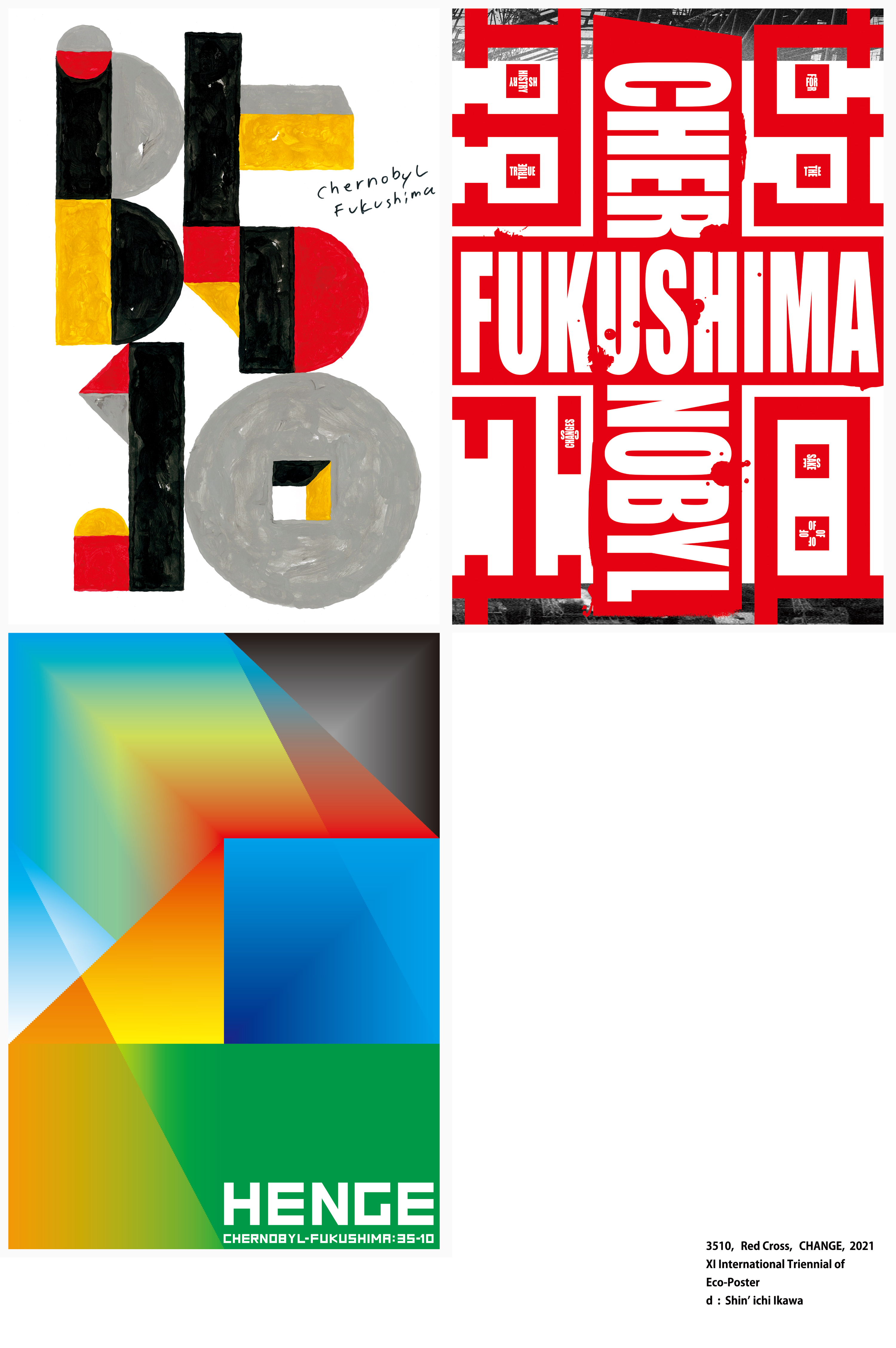


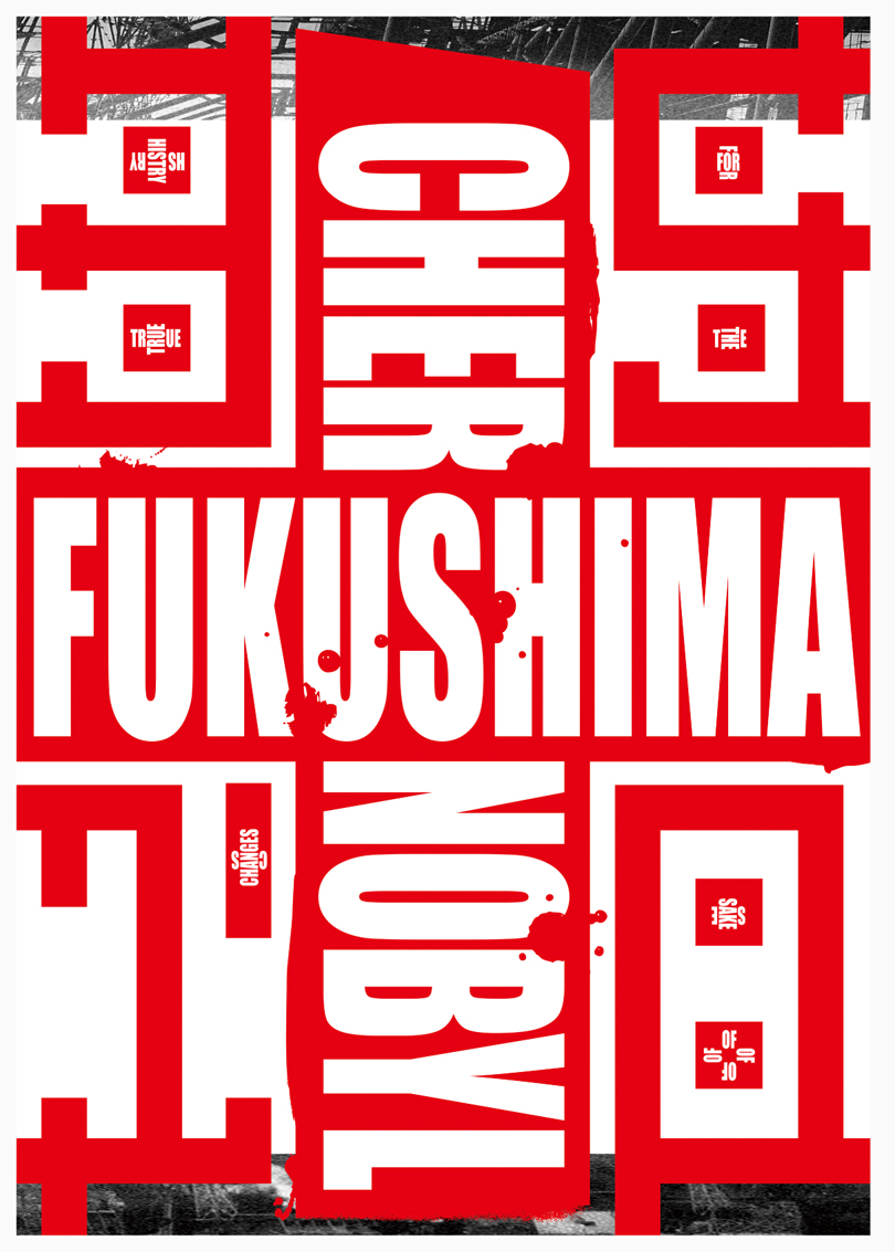

XI International Triennial of Eco-Poster | The 4th Block
Theme : Chernobyl-Fukushima 35-10
Title : 3510, Red Cross, CHANGE
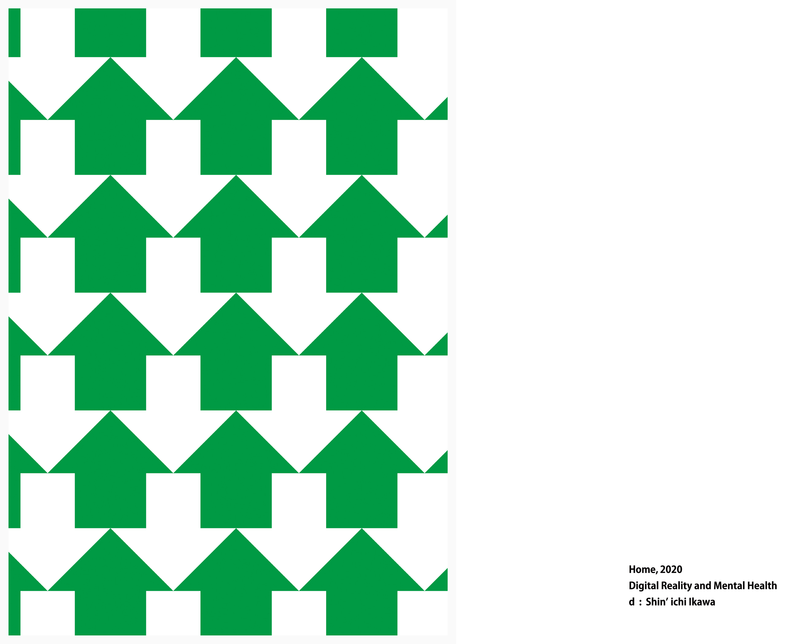
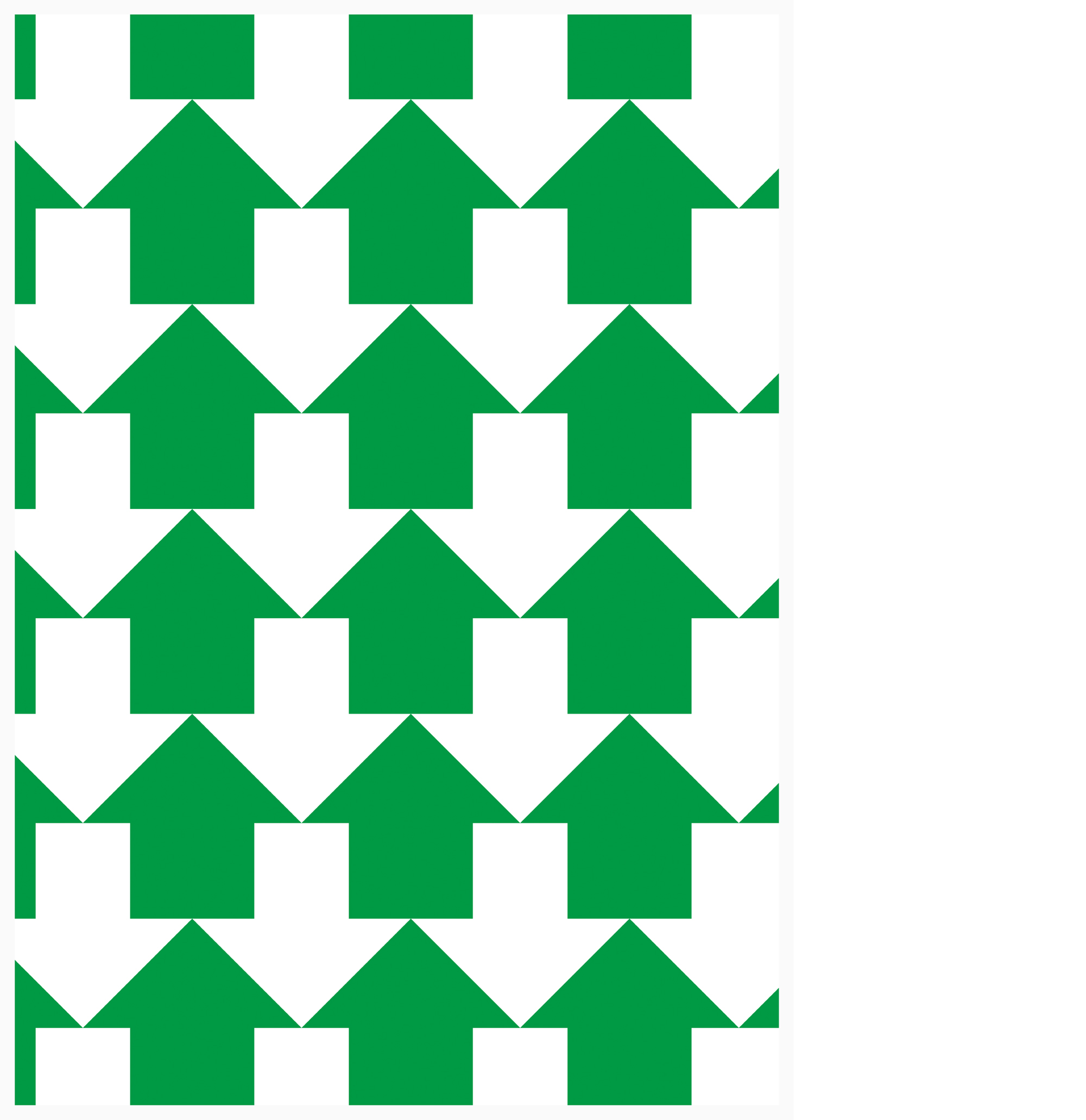

Digital Reality and Mental Health | The 4th Block
Title : Home

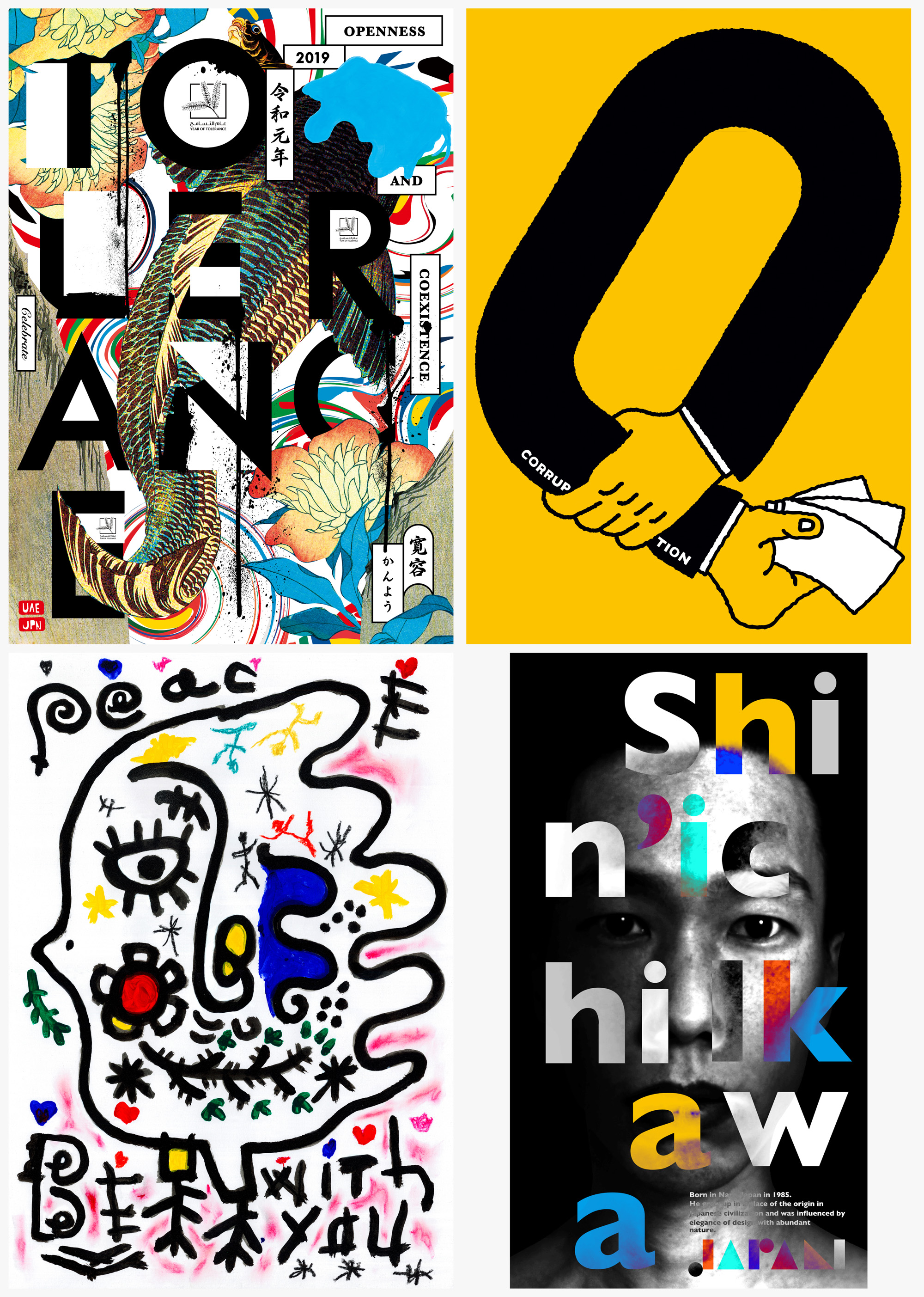



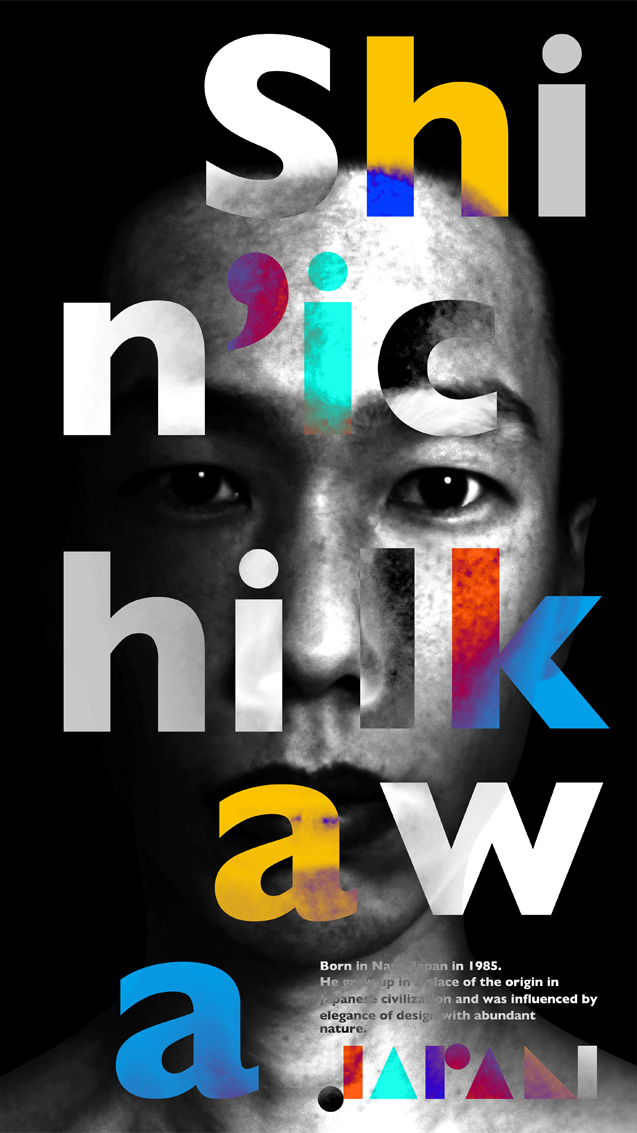
VINZAVOD CENTER FOR CONTEMPORARY ART | GLOBAL BIENNALE OF GRAPHIC DESIGN GOLDEN BEE 14
Theme : POSTER UNLIMITED / PEACE BE WITH YOU! / ZERO CORRUPTION / DESIGN-SELFIE
Title : The Waterfall of Tolerance, ZERO CORRUPTION, PEACE BE WITH YOU, Shin’ichi Ikawa


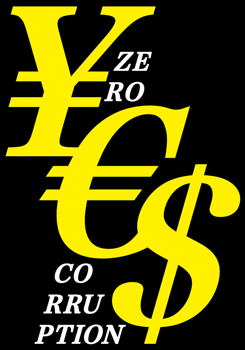

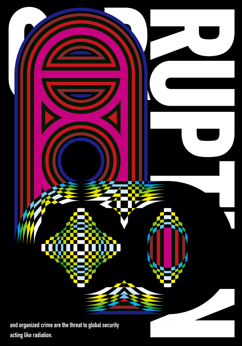
ZERO CORRUPTION | Special project of the International Triennial of Eco-posters
Theme : ENVIRONMENT • ANTI-CORRUPTION • SECURITY
Title : Yes, Radiation, Poison
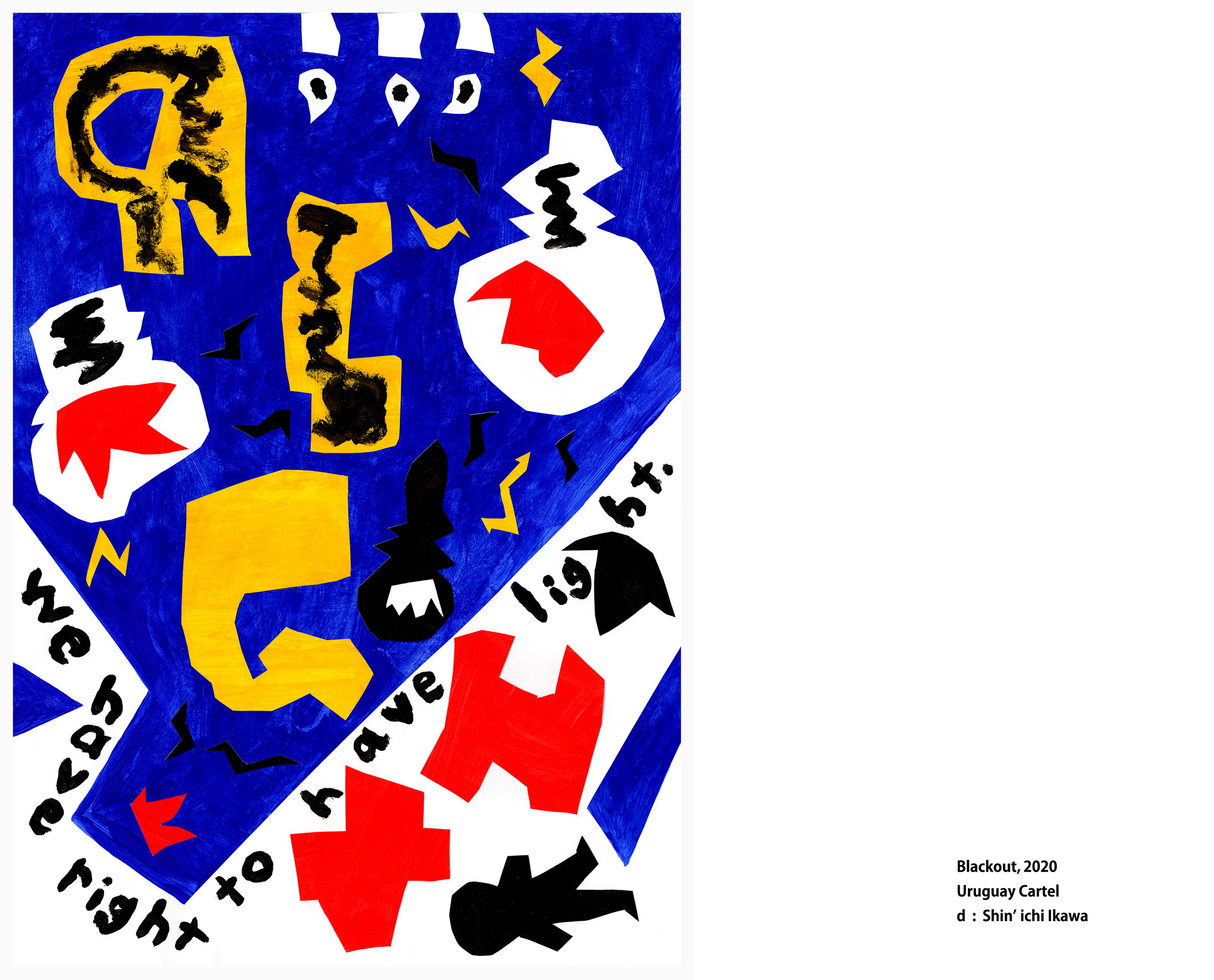

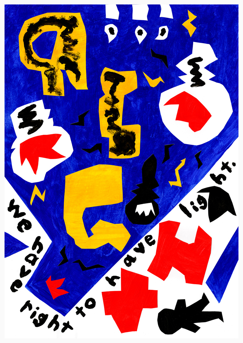
Uruguay Cartel 2020 | CENTRO CULTURAL BASTION DEL CARMEN
Theme : Social Gradient
Title : Blackout

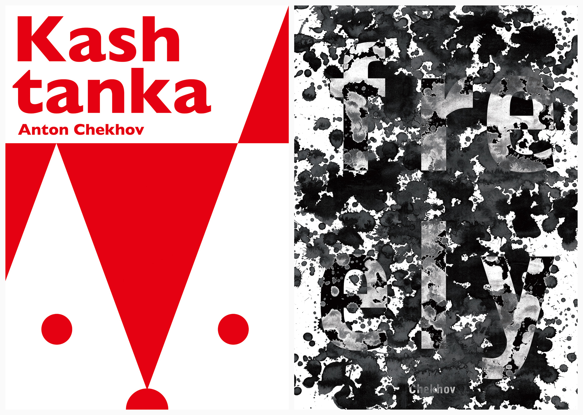
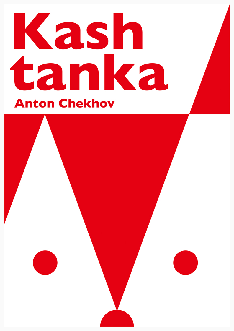
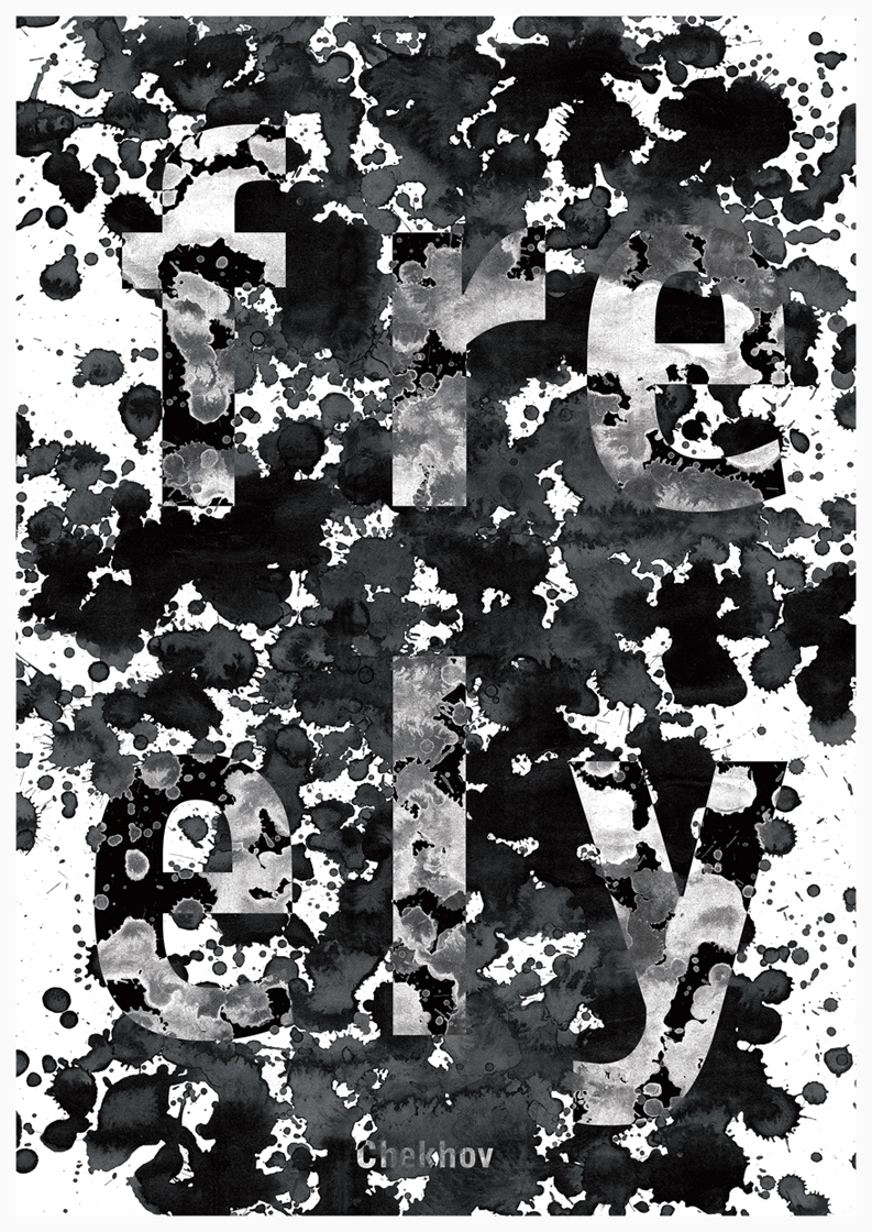
The poster action "Chekhov-160" | STRELKA International Design Biennale
Theme : Posters about Anton Chekhov's novels and his heroes from films, theatre. Posters about Anton Chekhov's life and biography. / Category A, B
Title : Kashtanka, freely
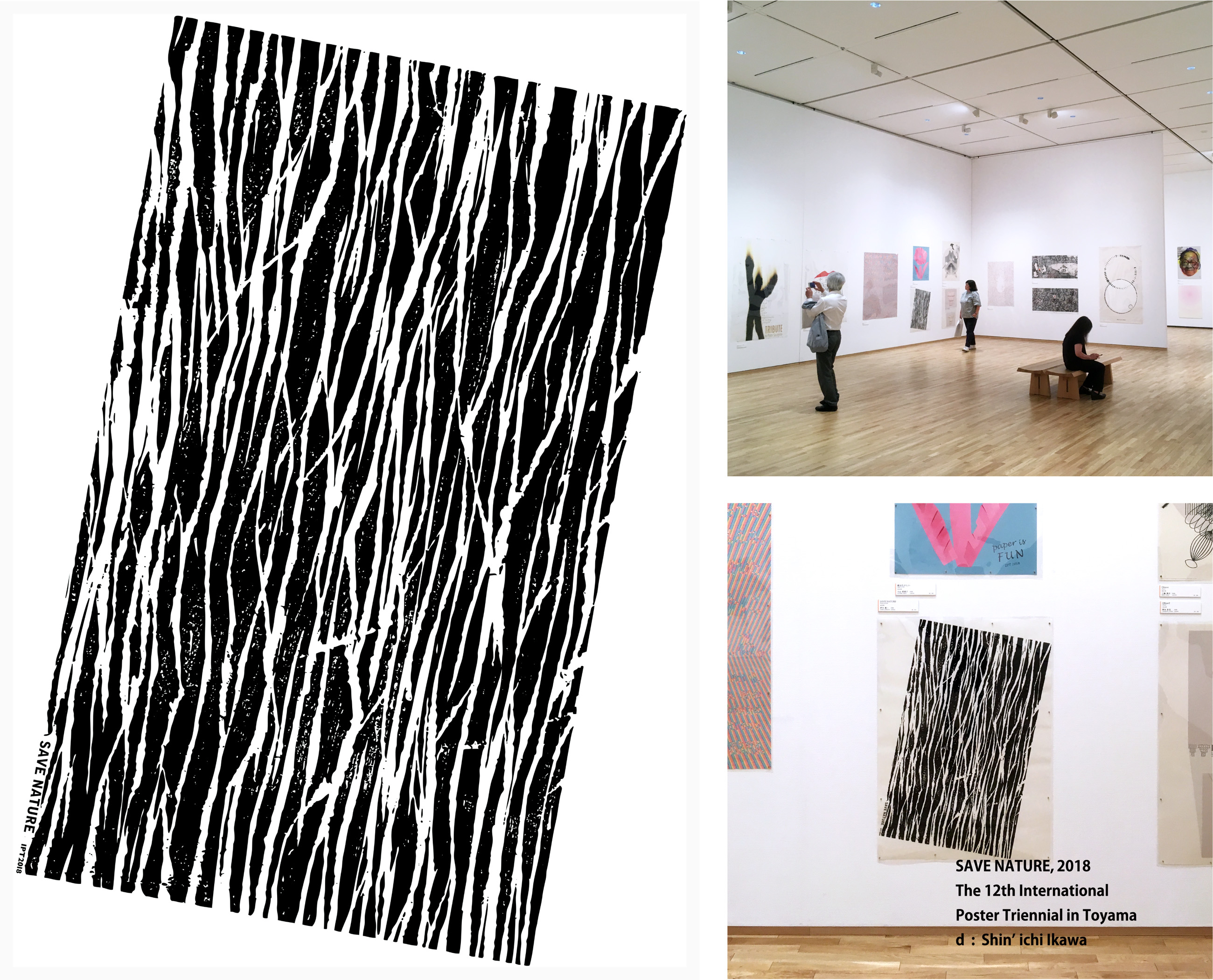
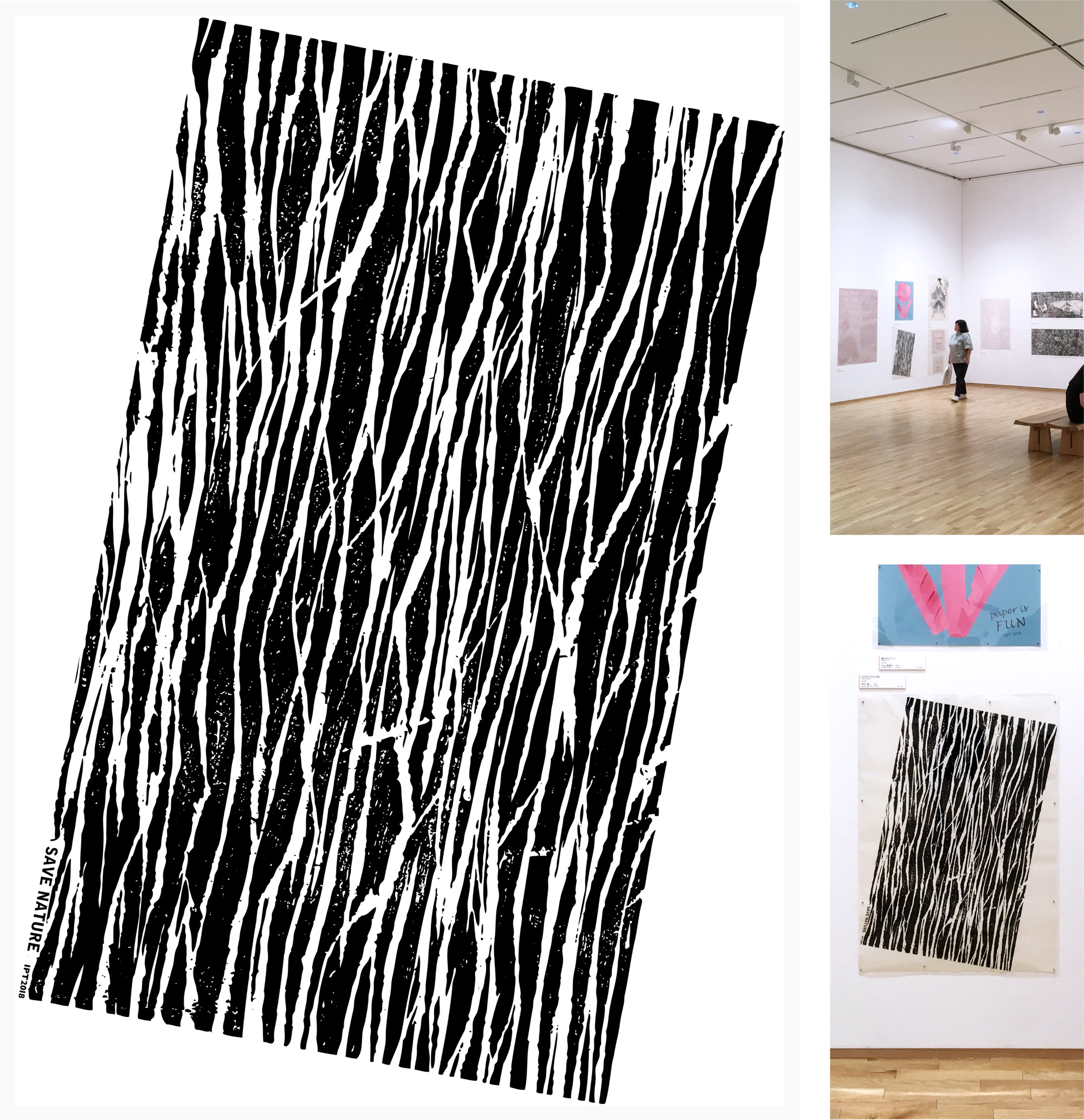
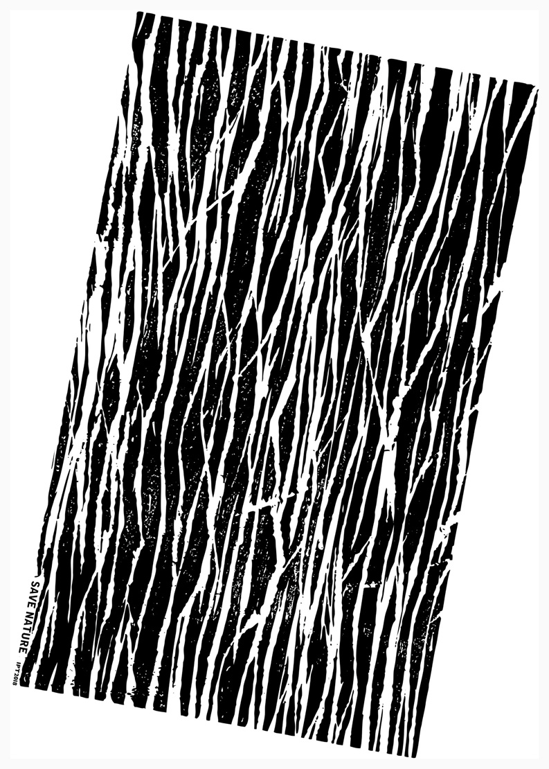
The 12th International Poster Triennial in Toyama, 2018 | Toyama Prefectural Museum of Art & Design.
Theme : / / Category B2
Title : SAVE NATURE
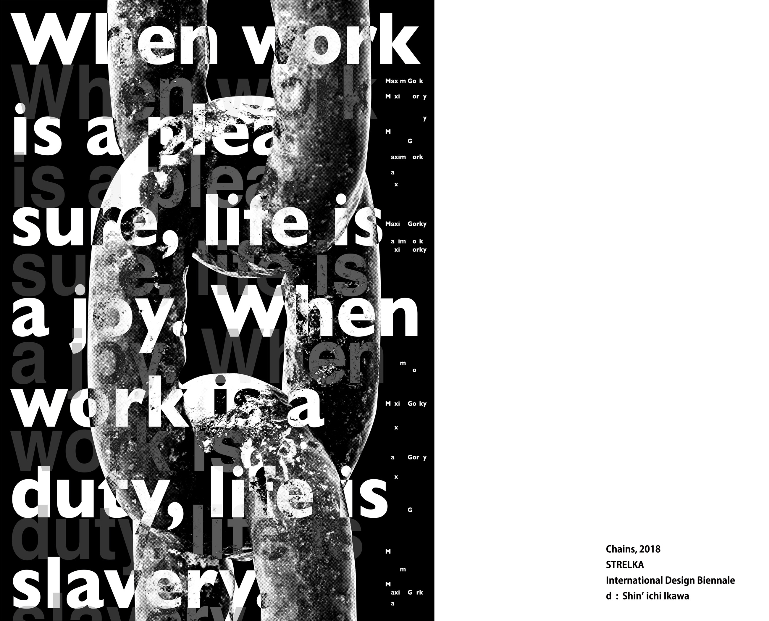

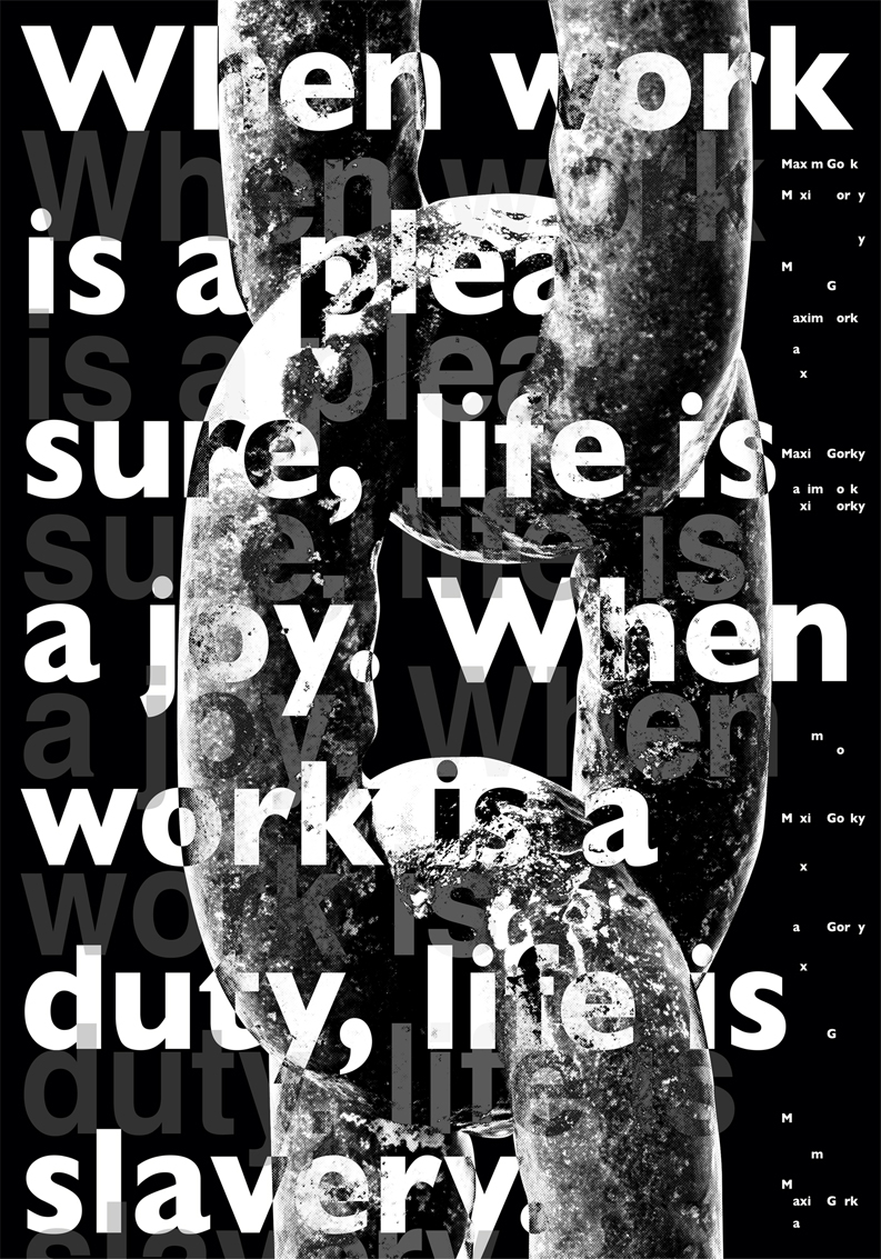
The poster action "Gorky-150" | STRELKA International Design Biennale
Theme : Posters about Maxim Gorky's life and biography. / Category B
Title : Chains
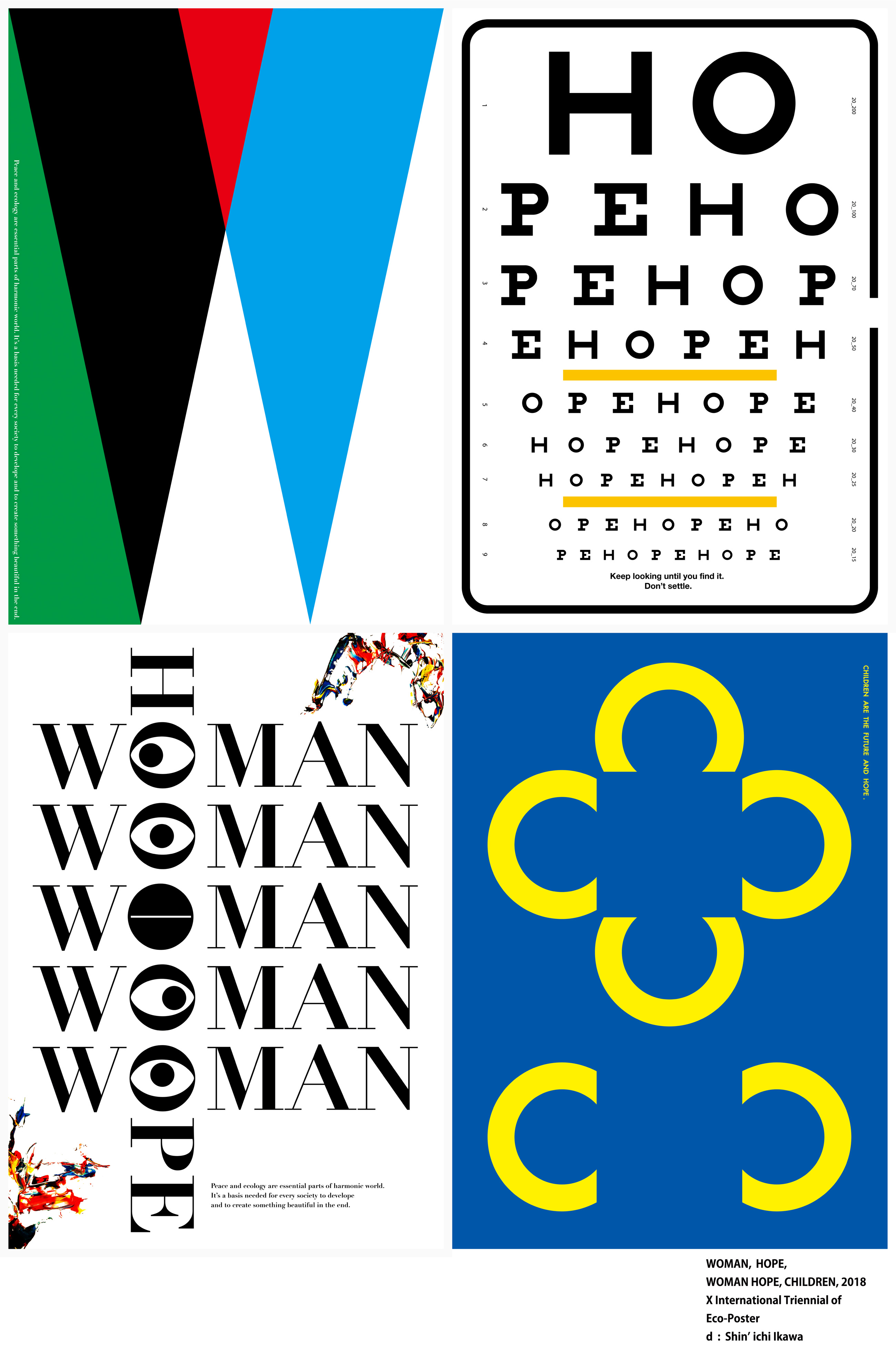
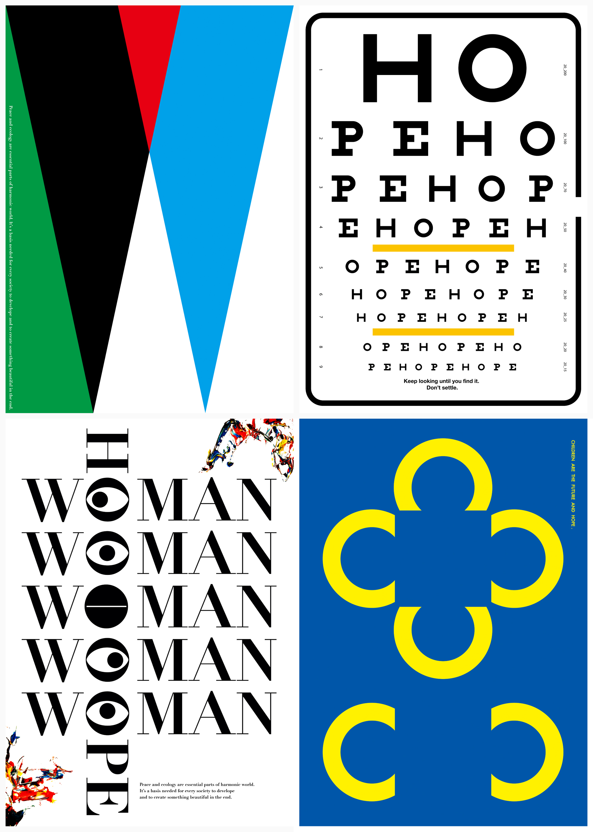
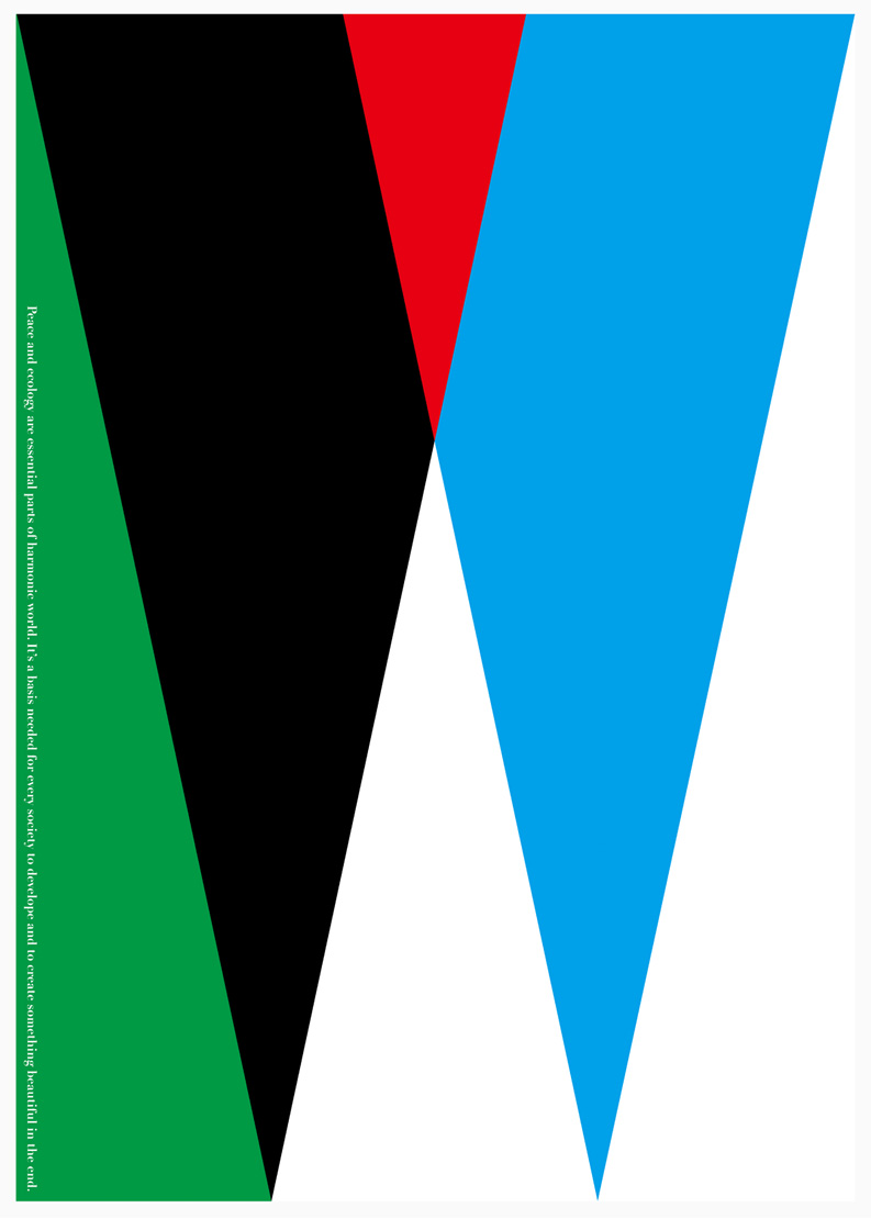


X International Triennial of Eco-Poster | The 4th Block
Theme : WOMEN, CHILDREN / Category 1, 2
Title : WOMAN, HOPE, WOMAN HOPE, CHILDREN
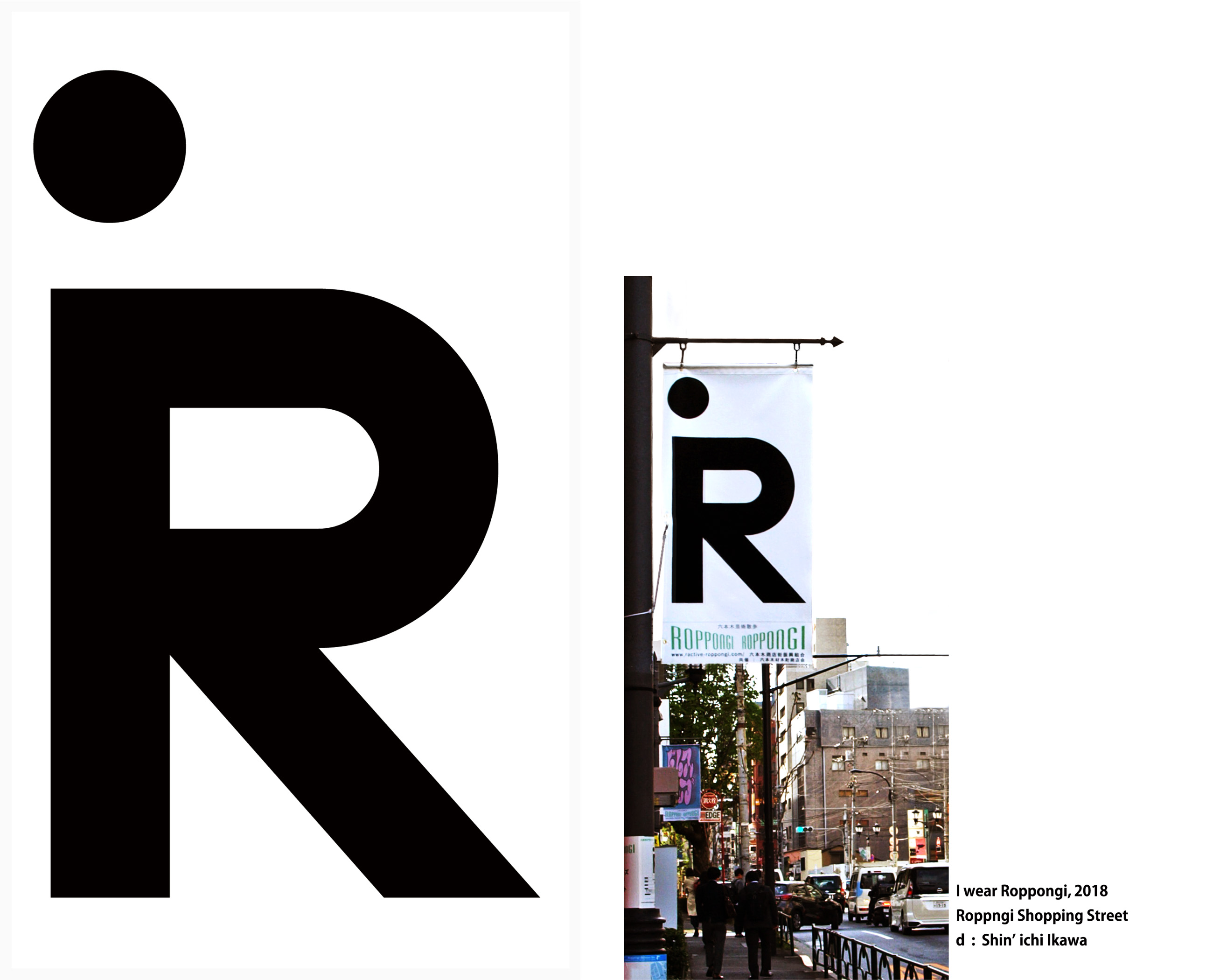
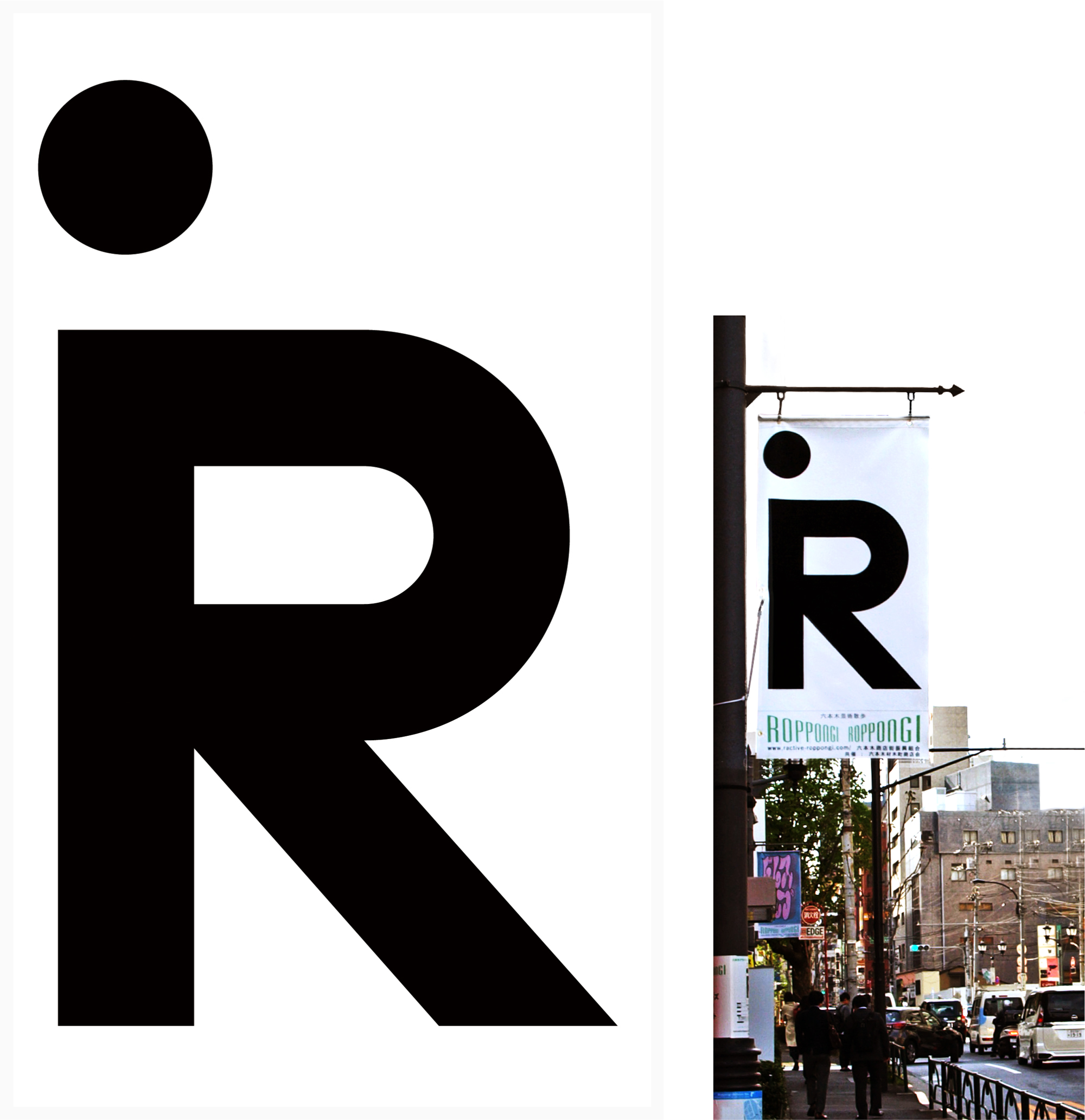

Roppongi Designer’s Flag Contest 2018 | Roppngi Shopping Street
A visual created for street flags decorating the Roppongi shopping district. Each year, the theme changes, and the 2018 theme was “Attire.”
Title : I wear Roppongi
Roppongi is a city that evokes the diverse ways people express themselves through what they wear. By combining the letters “i” and “R,” the visual represents the individual styles and appearances of the people who visit Roppongi.

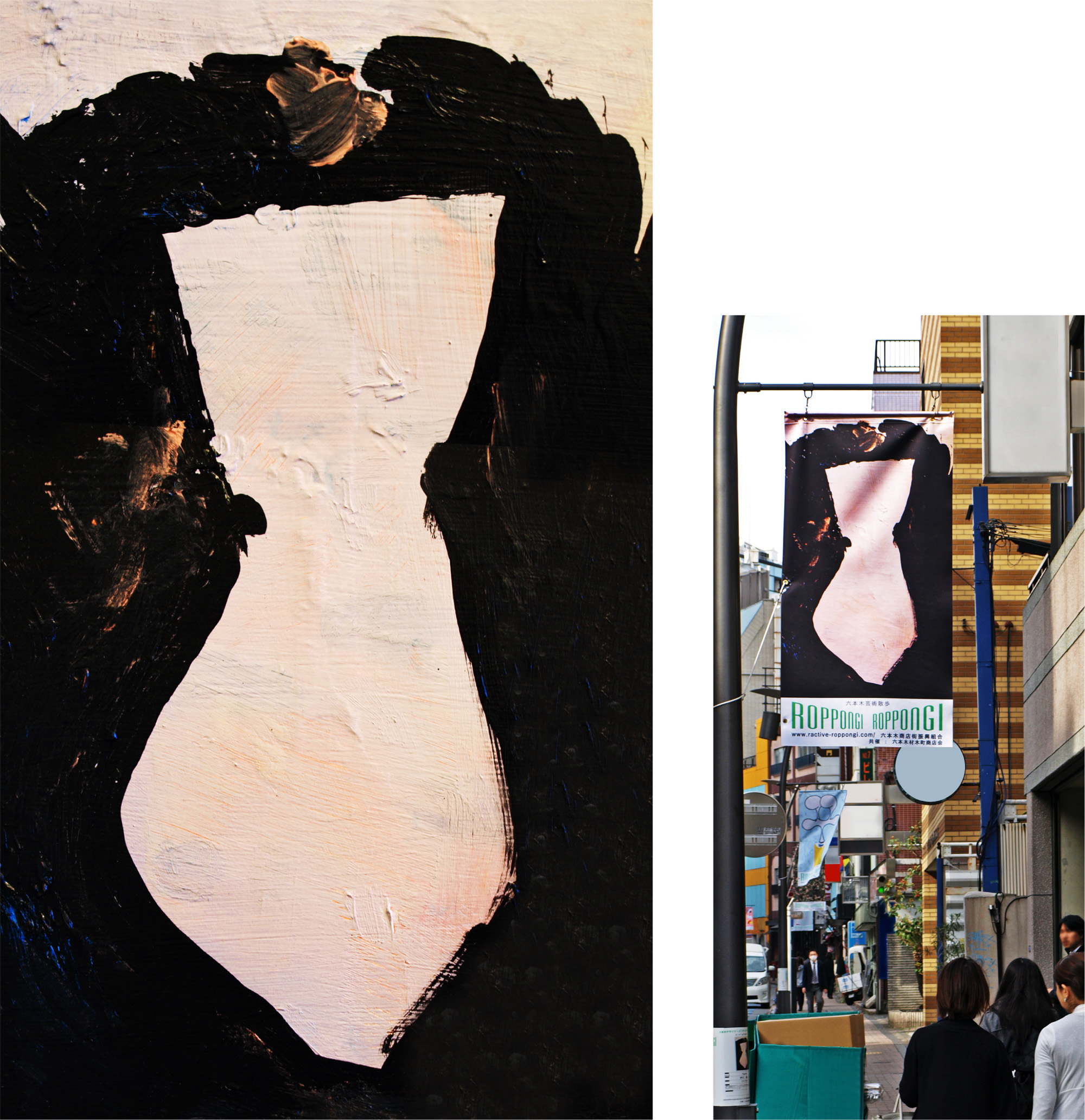
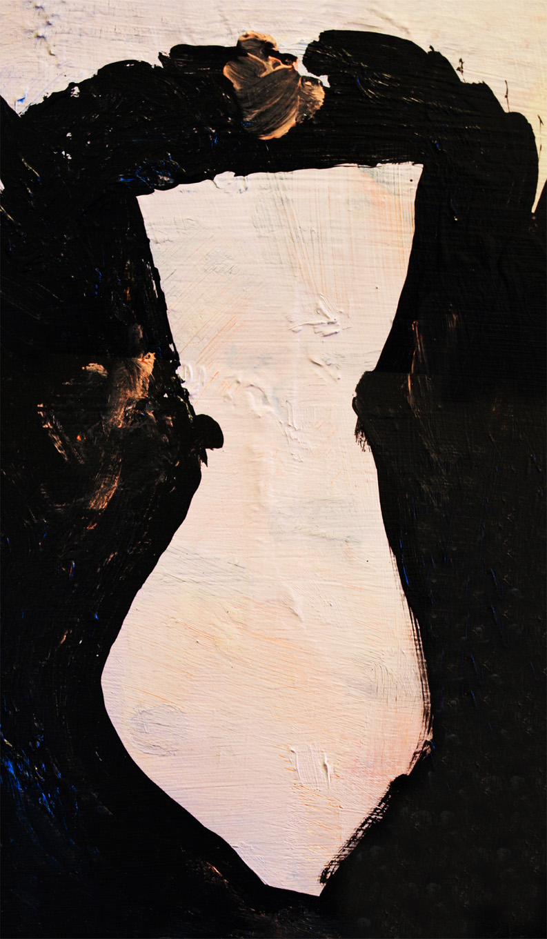
Title : Figure
The visual gives form to the diverse expressions of attire found in Roppongi.
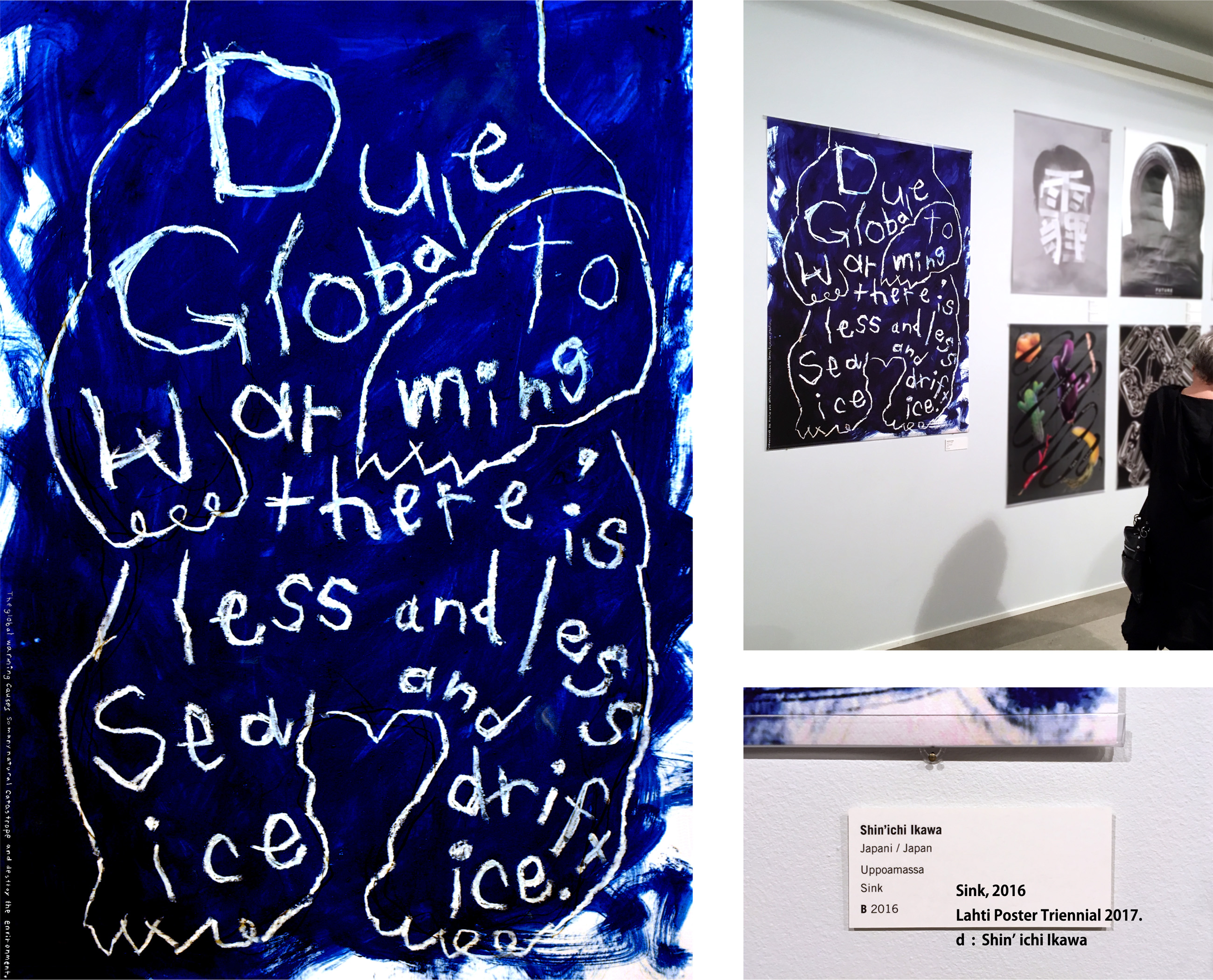
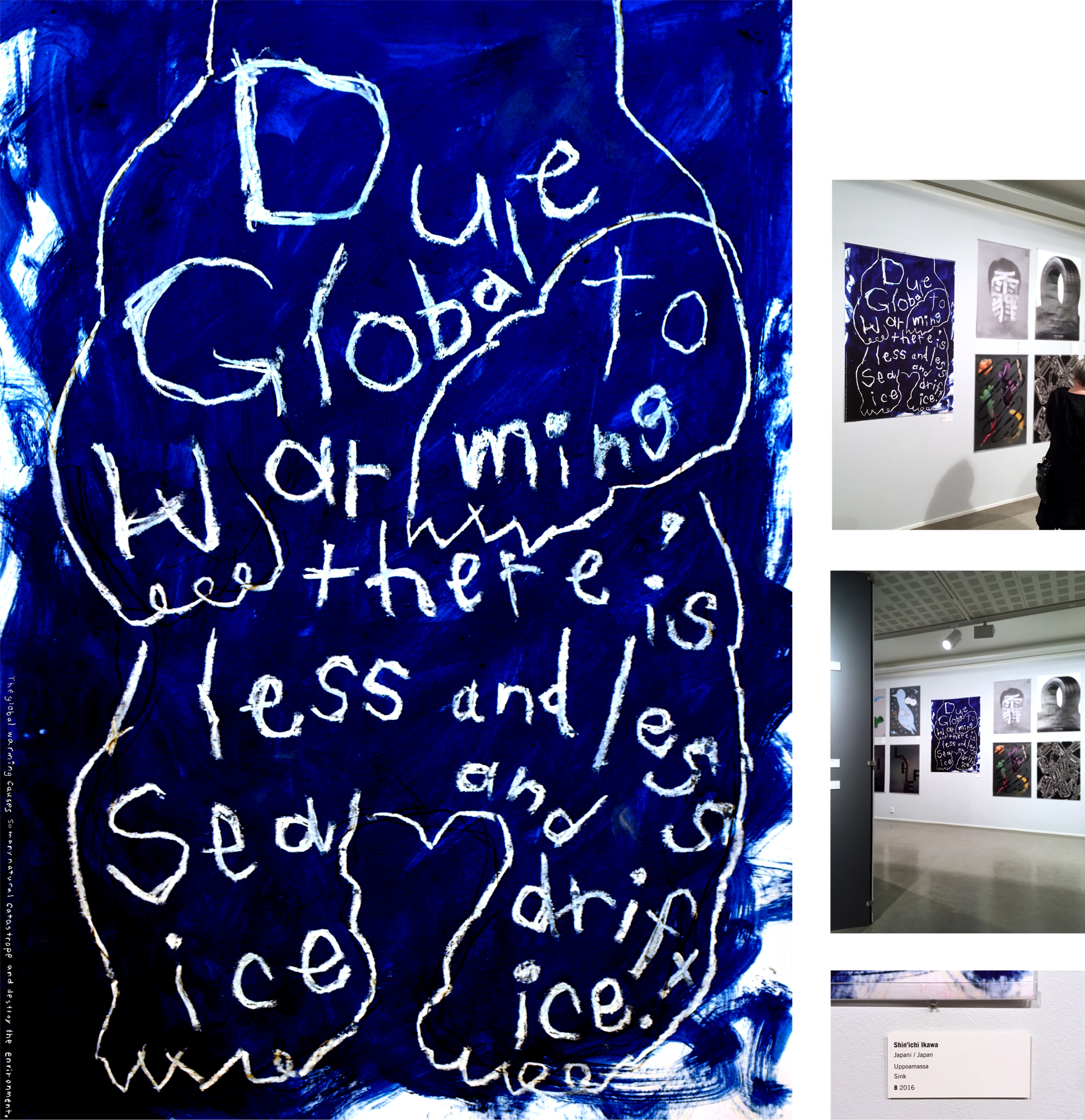

Lahti Poster Triennial 2017 | Lahti Poster Triennial 2017
Theme : Environmental Posters / Category B
Title : Sink
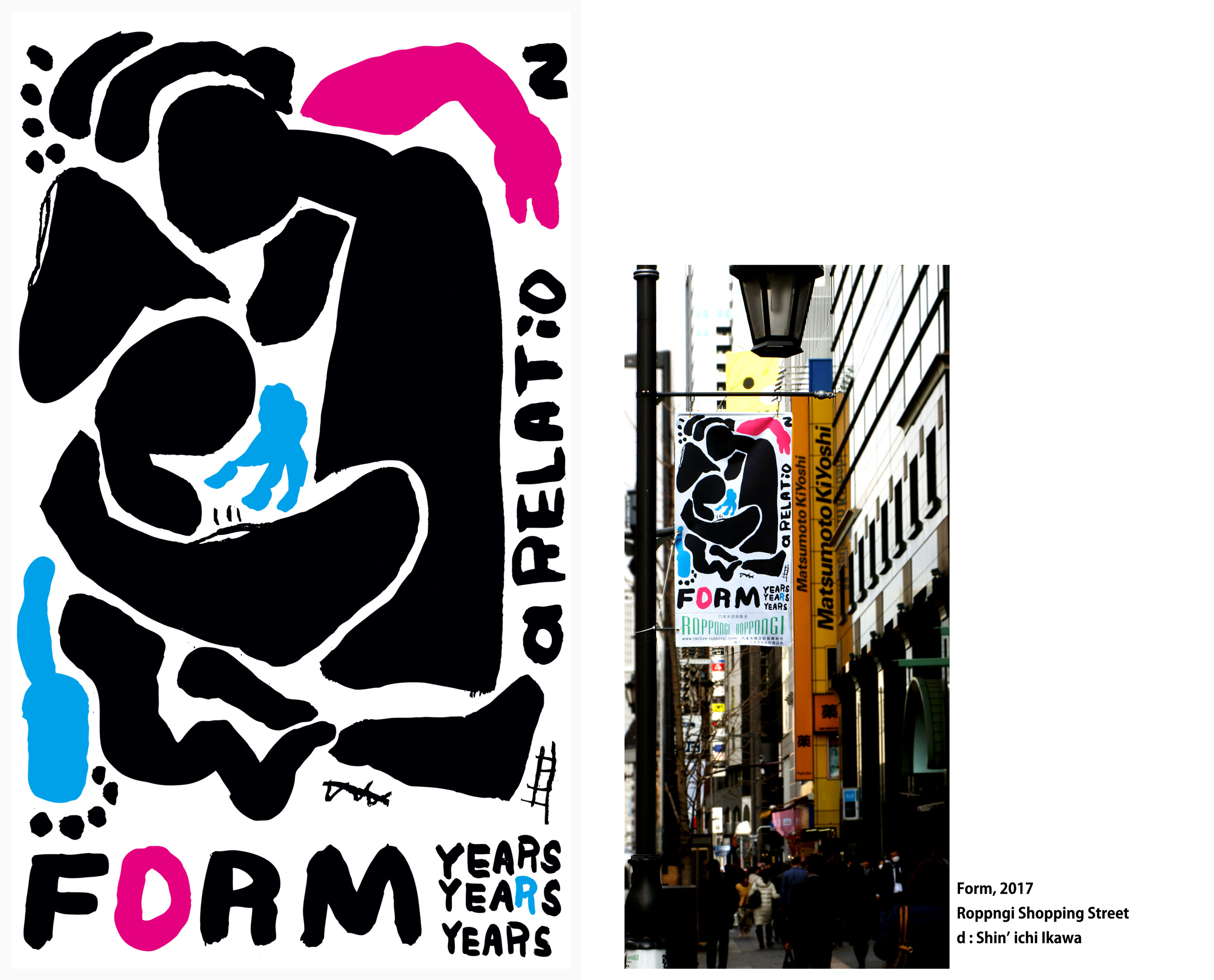
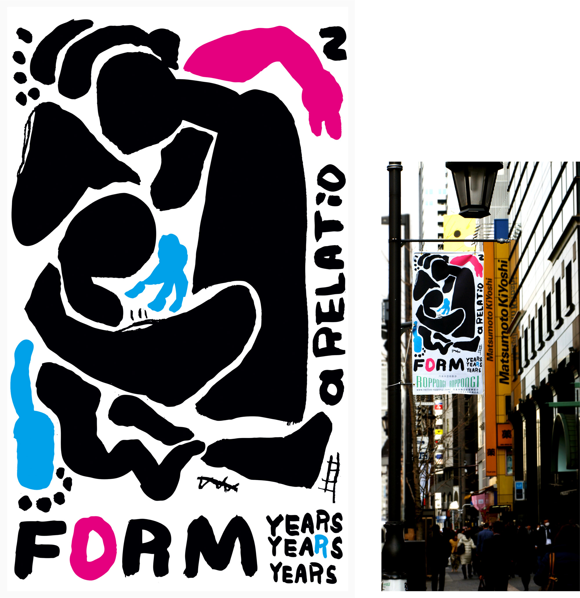

Roppongi Designer’s Flag Contest 2017 | Roppngi Shopping Street
A visual created for street flags decorating the Roppongi shopping district. Each year, the theme changes, and the 2017 theme was “Encounters.”
Title : Form
Roppongi is a city that fosters diverse encounters, both locally and internationally. The visual expresses the process of people coming together and forming meaningful connections.
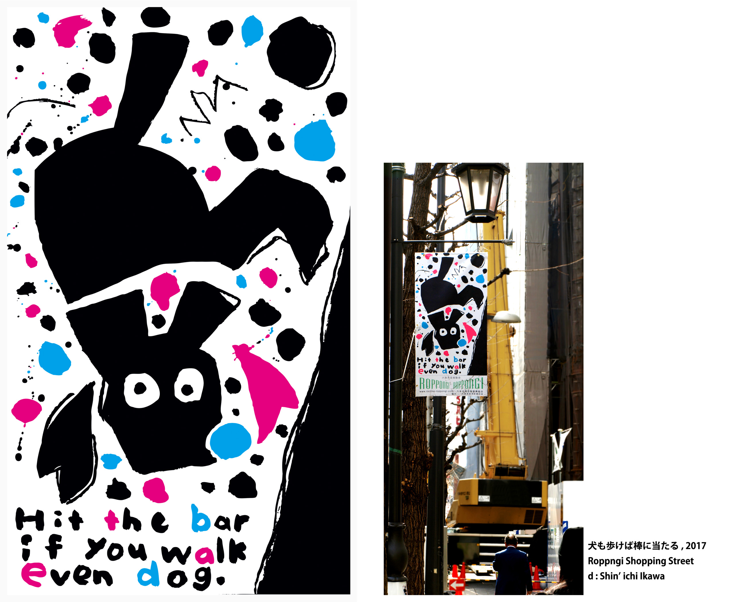
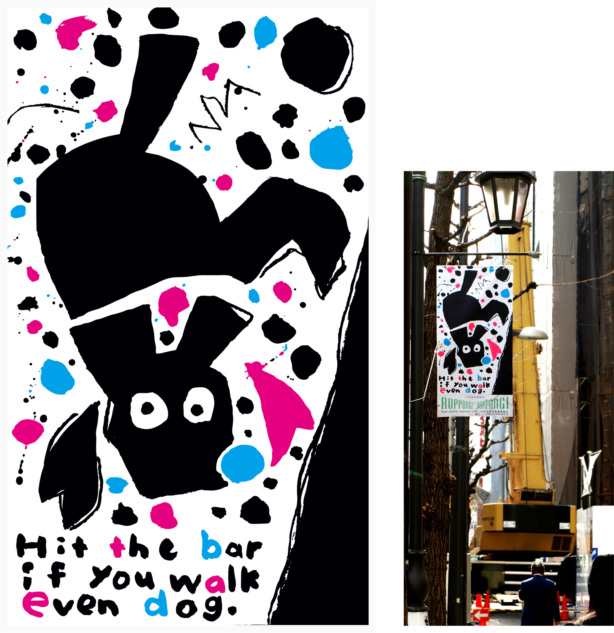

Title : Hit the bar if you walk even dog
Roppongi is a vibrant city full of excitement and inspiration. Once you visit, it is impossible to stand still. By taking on new challenges, you may encounter unexpected opportunities and good fortune. This visual expresses the exhilarating encounters that await in Roppongi.


Ecuador Poster Bienal | Ecuador Poster Bienal
Theme : Social Posters / Category B
Title : ‘e’

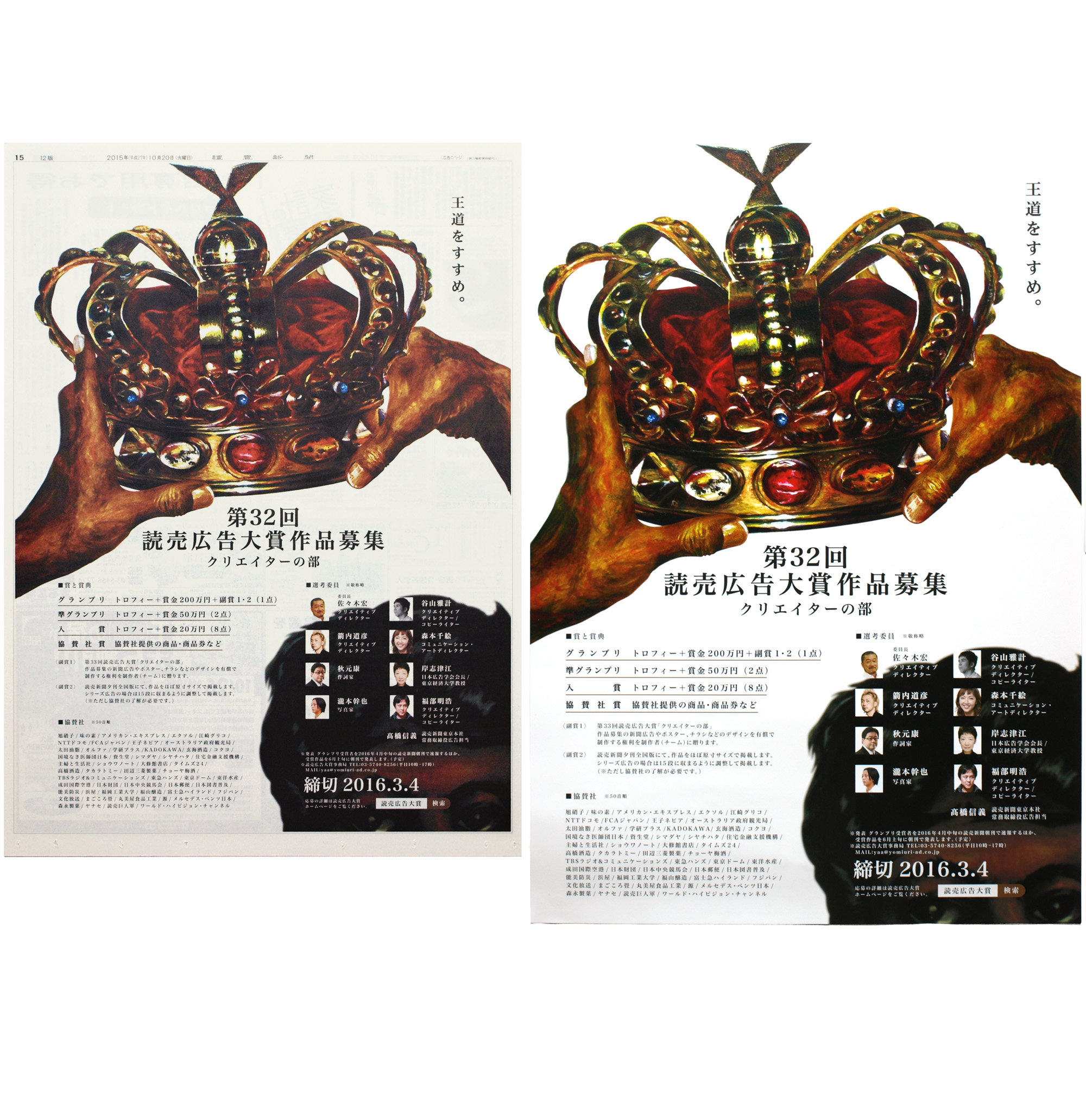
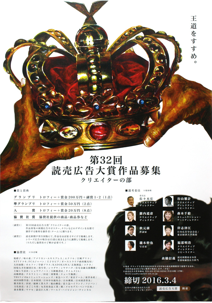
Advertisement campaign | The Yomiuri Shimbun.
Title : An Encouragement of the Classic Way
The Yomiuri Advertising Award aims to revitalize newspaper advertising. We developed and produced a communication campaign that extended from newspaper advertisements to posters, leaflets, and a crown-shaped collection of award-winning works, creating a unified story from the call for entries through to the awards ceremony.
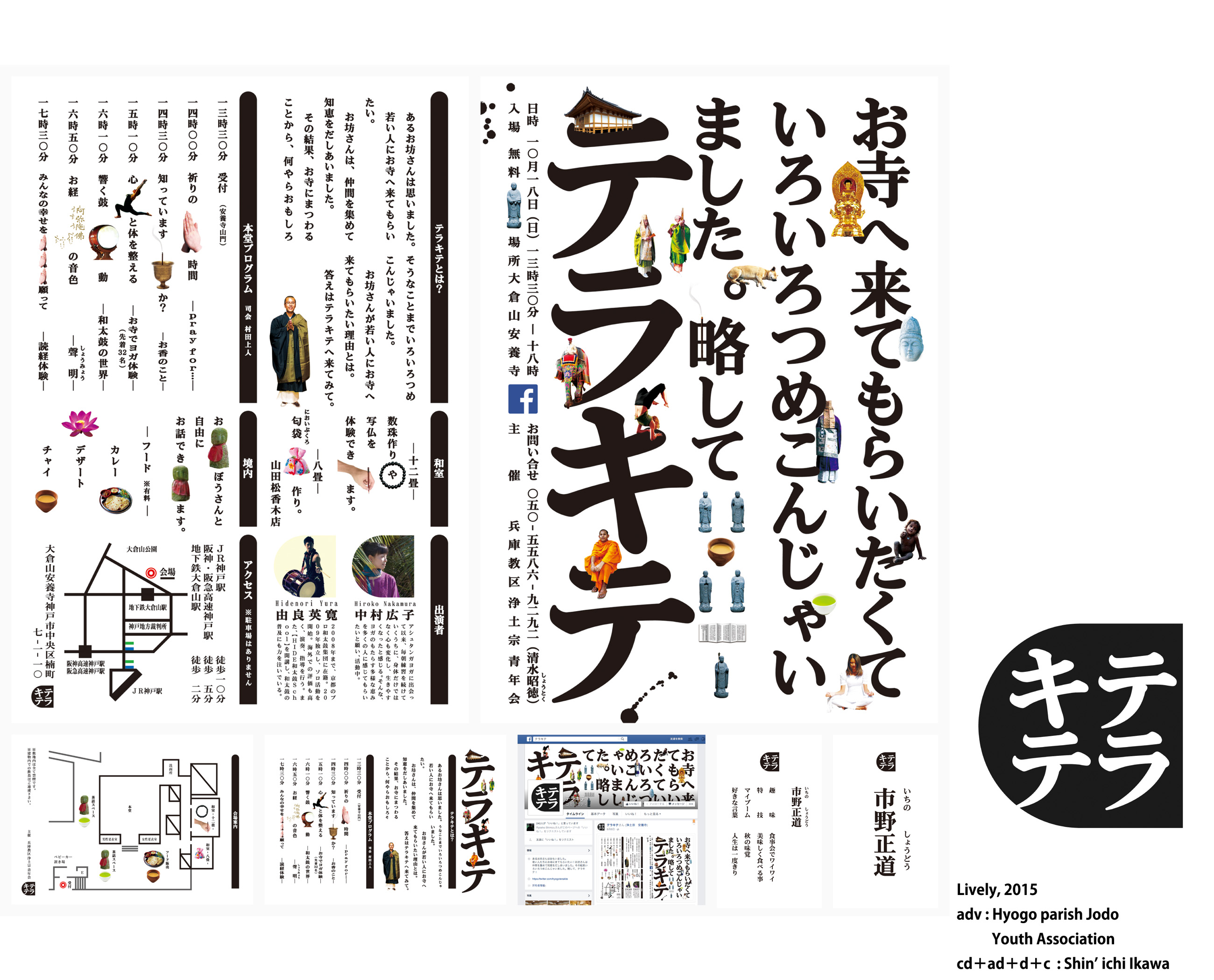
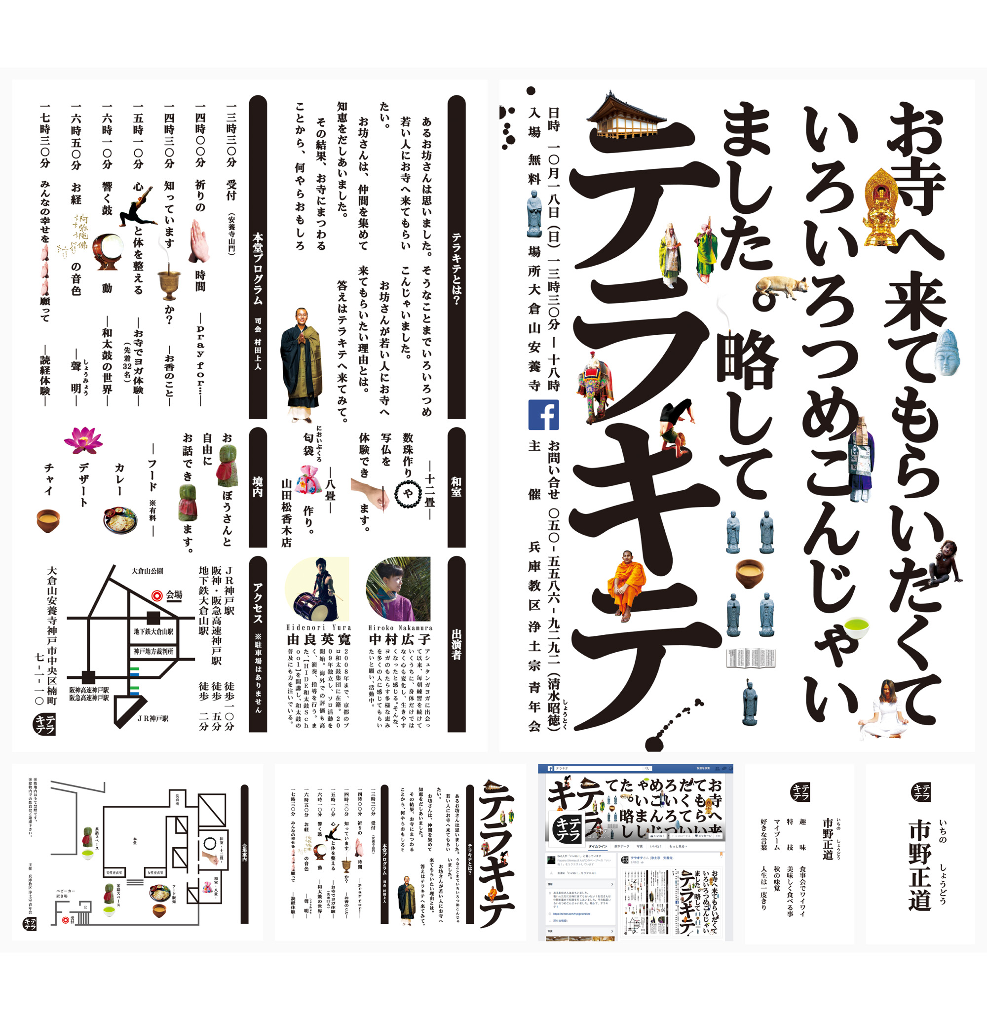
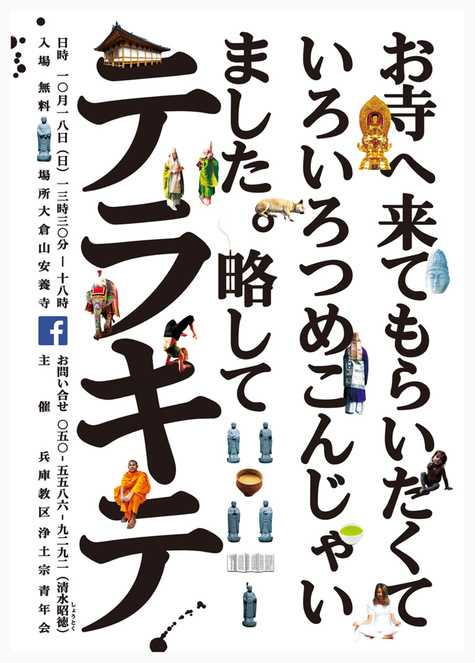
TERAKITE | Hyogo parish Jodo Youth Association
Title : lively
“TERAKITE” is a temple event aimed at attracting younger audiences. The project encompassed the entire creative direction, from the event naming and logo design to the poster, leaflet, and Facebook page.
The event featured a diverse range of programs, while its young audience was seeking new experiences and stimulation. “Lively” was developed as the central concept, reflecting both the variety of the event and the energy of its young audience.
The monks’ sincere wish was simple: to encourage people to come to the temple. This straightforward message was translated directly into the visual identity.
On the day of the event, the monks handed out “Friend Cards” to visitors, creating a system that allowed the temple to maintain a connection with them beyond the event itself.
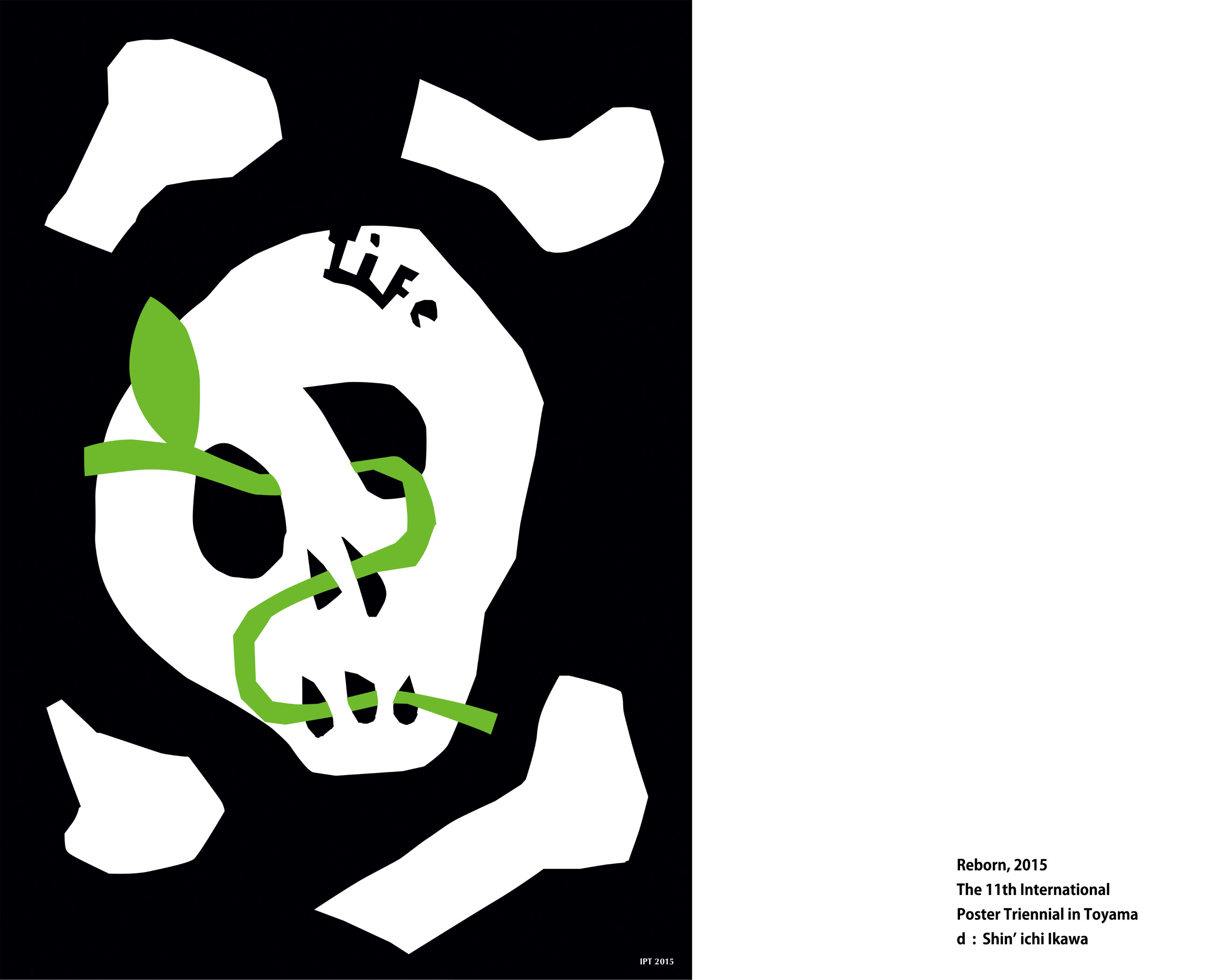


The 11th International Poster Triennial in Toyama, 2015 | The Museum of Modern Art, Toyama.
Theme : LIFE / Category B1
Title : Reborn
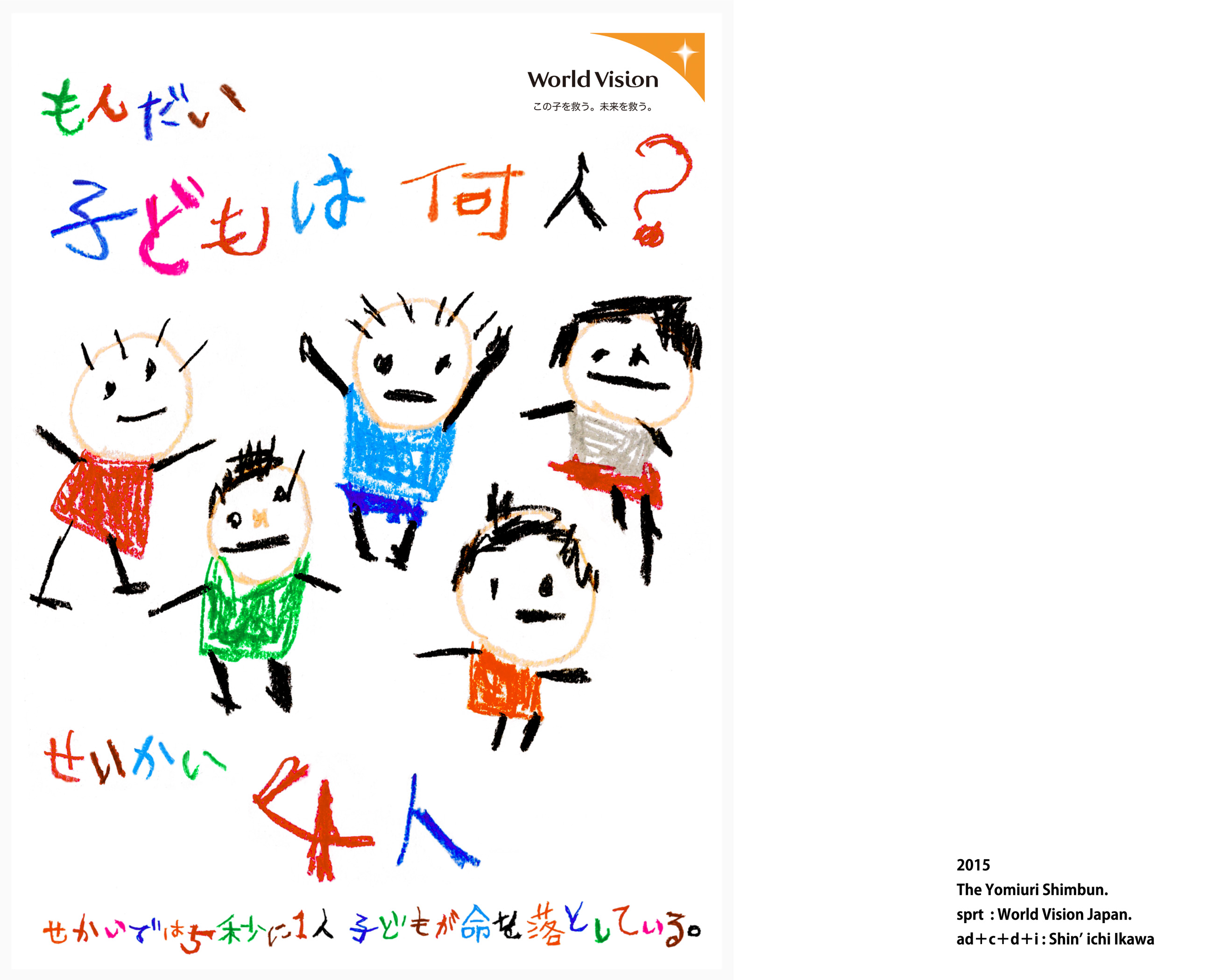

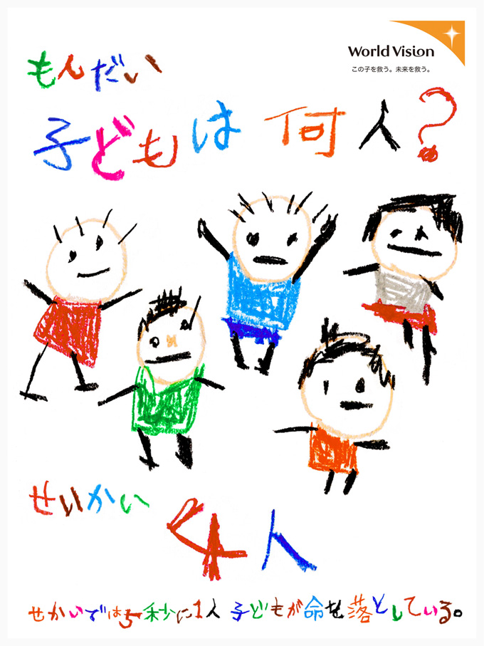
The 31th Yomiuri Advertising Awards | The Yomiuri Shimbun.
Theme : Child sponsorship / World Vision Japan.
Catchphrase / Quiz. How many children are there? Answer. Four.
Sales copy / Every five seconds, one child loses their life somewhere in the world.
As you count the children, five seconds pass, and one child disappears.
The current situation of children around the world is portrayed from a child’s perspective.
※Proposed publication date: May 5, Children’s Day in Japan.

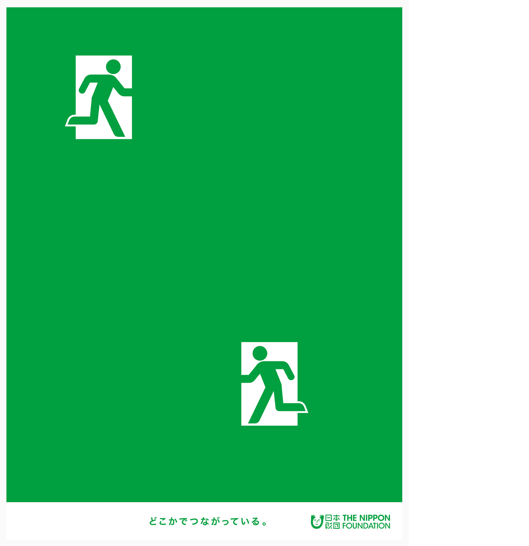
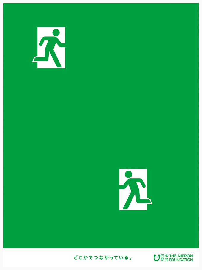
Theme : Cool donation / The Nippon Foundation
The activities of The Nippon Foundation connect people with one another.
Although these connections may not always be visible, we are connected in ways that extend beyond what we can see.
The bright future beyond the emergency exit represents the hope created through these invisible connections.
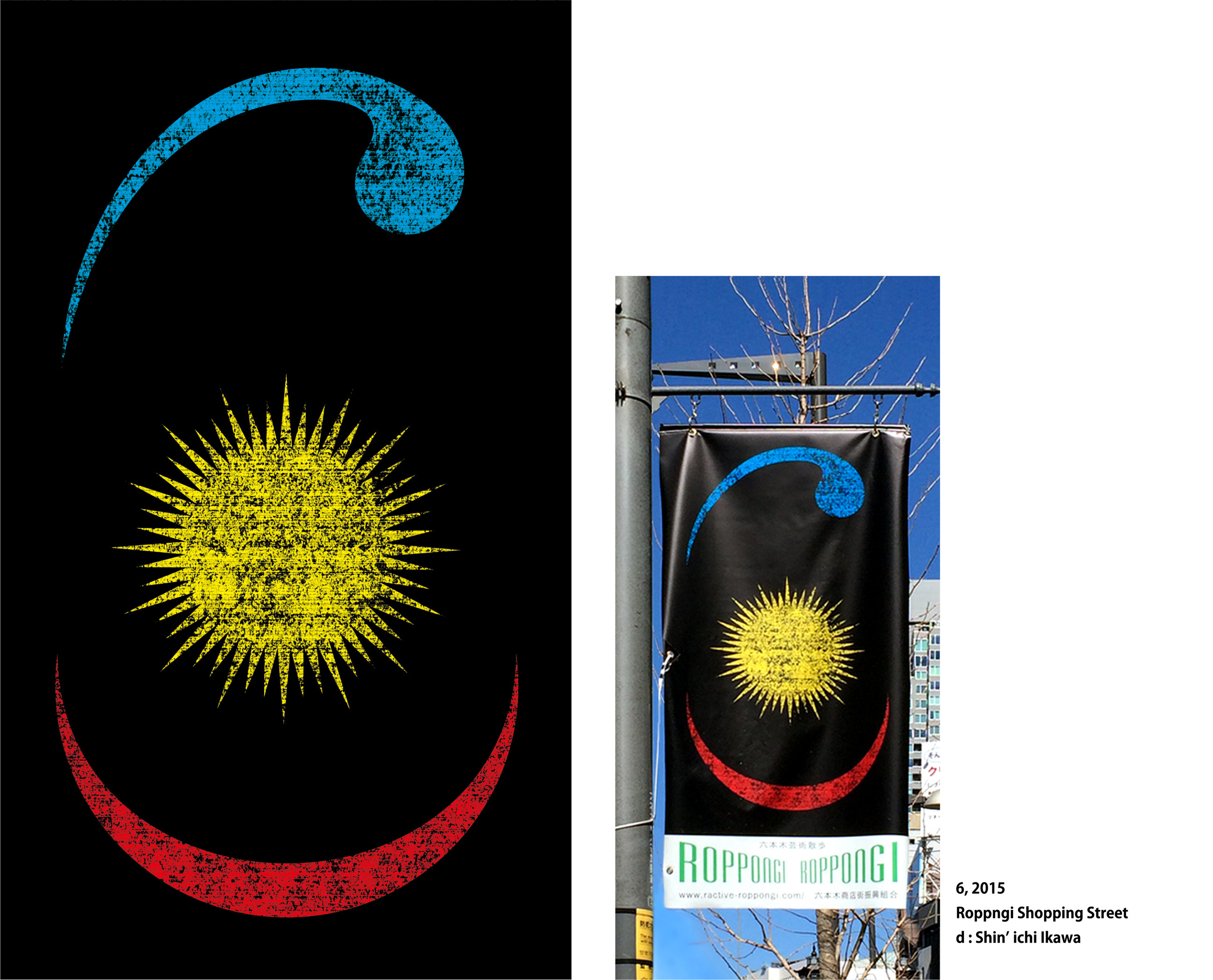


Roppongi Designer’s Flag Contest 2015 | Roppngi Shopping Street
Title : 6
A visual created for street flags decorating the Roppongi shopping district. Each year, the theme changes, and the 2015 theme was “Day and Night.”
The large “6” motif is composed of lines representing the sun, the moon, and the movement of people. The symbol brings together the contrasting expressions of Roppongi by day and by night into a single visual form.
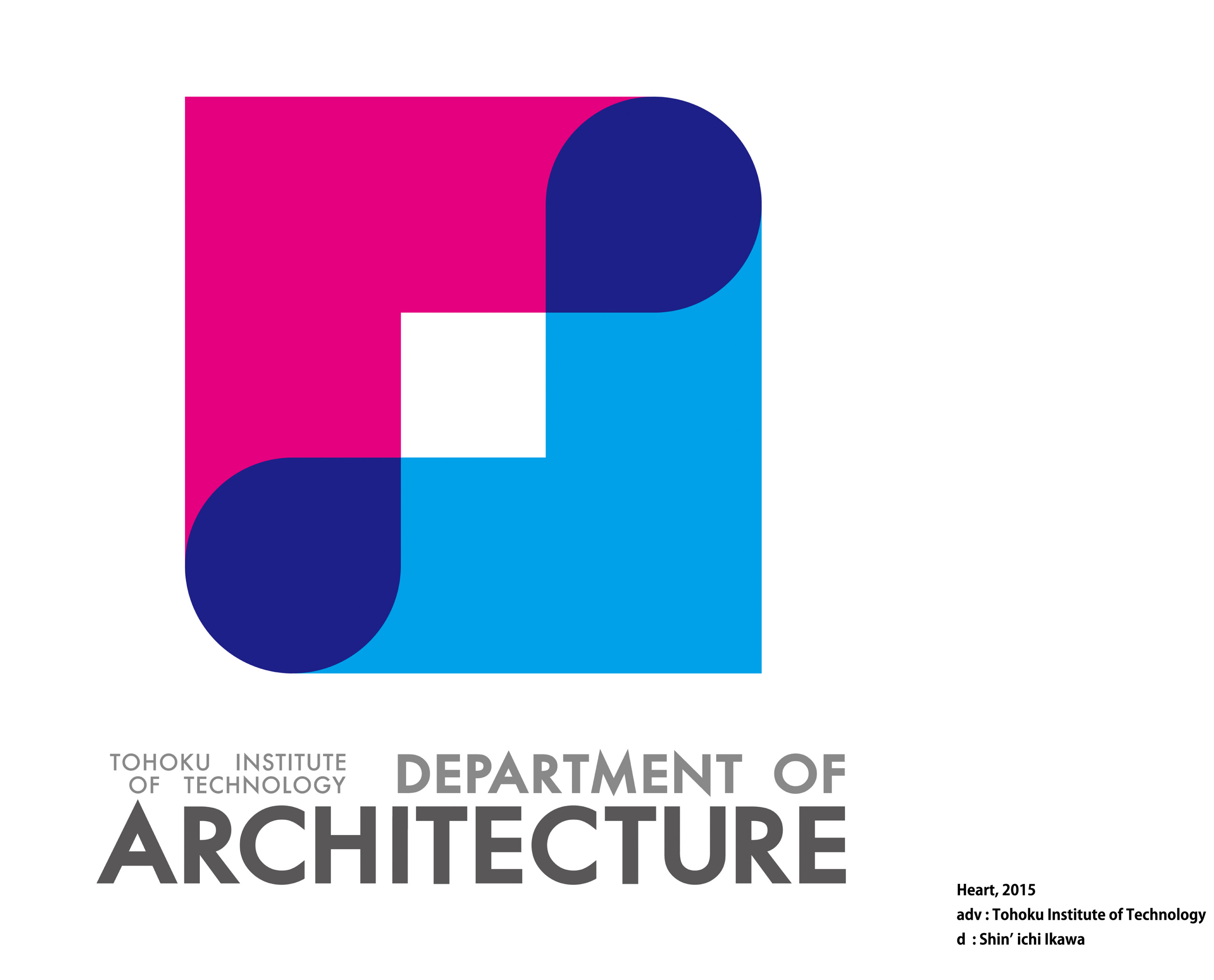

Visual Identity | Tohoku Institute of Technology, Department of Architecture
Title : Heart
The visual identity expresses the Architecture Department’s commitment to creating safe and comfortable living spaces by combining heart shapes inspired by the letter “A,” the initial of “Architecture.”
Pink represents compassion for people and the environment, while blue represents knowledge and technical expertise. The overlapping of these two elements symbolizes the department’s firm commitment to creating safe and comfortable living spaces for society.
The identity embodies the department’s mission to nurture the next generation of professionals who will shape the future.

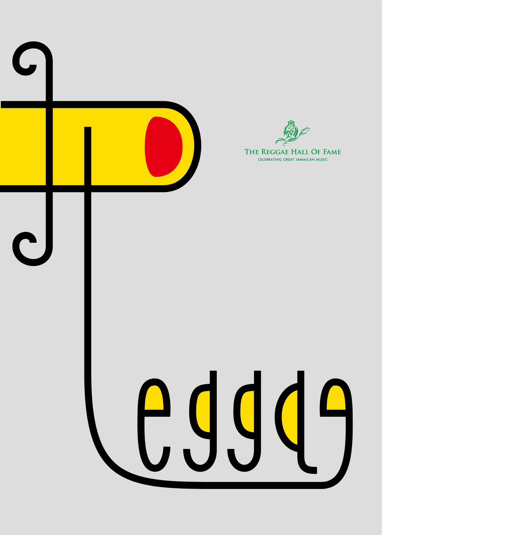
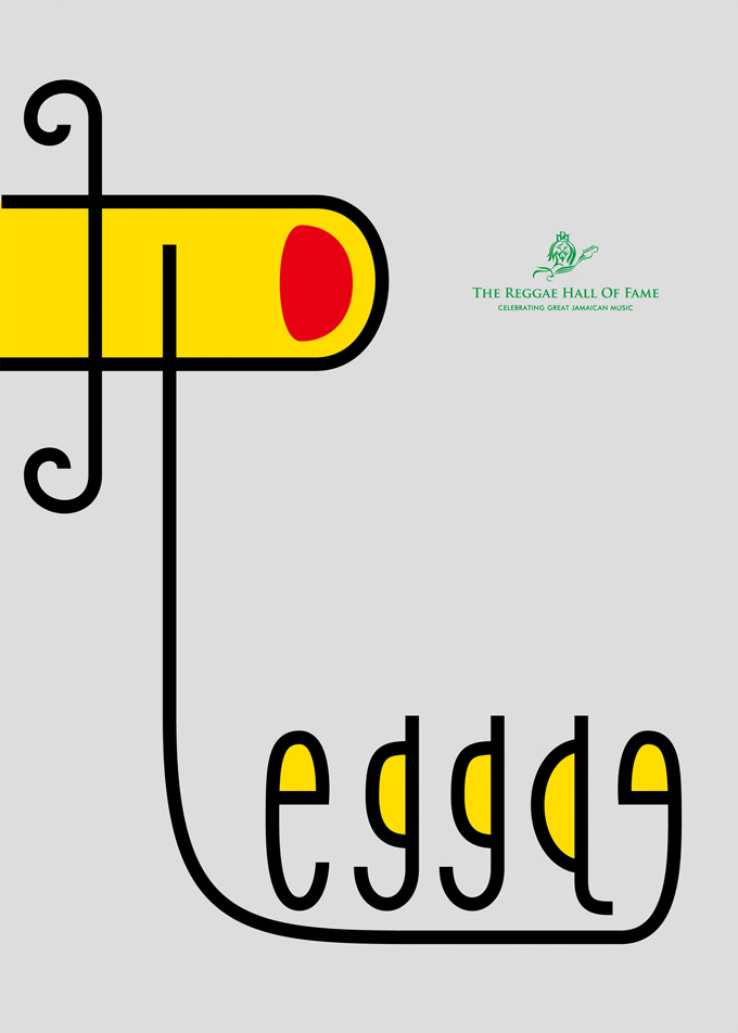
The International Reggae Poster Contest 2014 | IRPC
Title : Indicate
A poster created to celebrate the greatness of Jamaican music and promote the establishment of a Reggae Hall of Fame.
The concept was “Indicate” Reggae is a musical genre shaped by the diverse ethnic and cultural backgrounds of Jamaica. Despite this diversity, fingers are something everyone shares.
As the fundamental tools used to create music, the fingers form the word “Reggae” while indicating the award logo. The visual expresses how reggae, a music born from Jamaica’s diversity, brings people together as one and indicates the power and appeal of the genre.
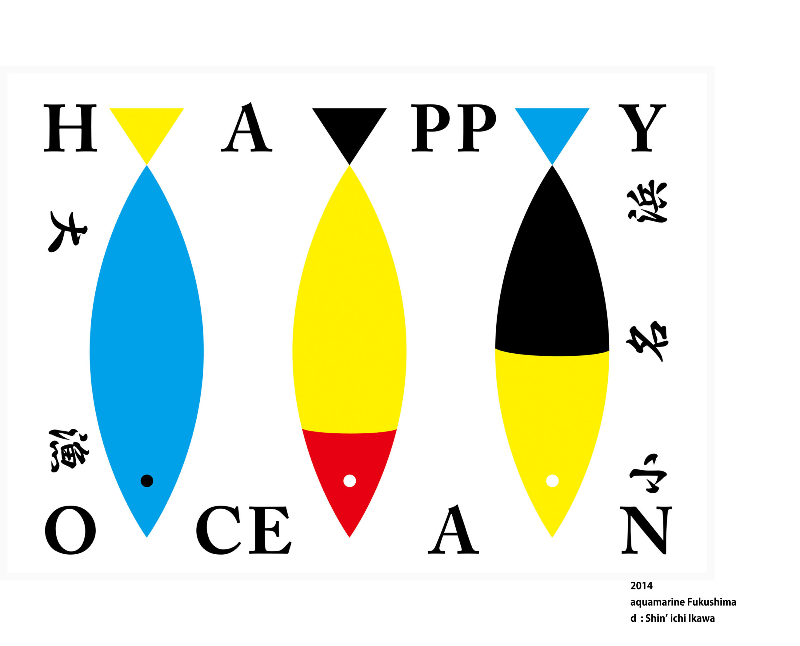


Great Catch Flag | Aquamarine Fukushima
A design for a traditional fishing flag commissioned by Aquamarine Fukushima, a marine science museum in Fukushima. The design was created according to the requirement that the words “HAPPY OCEANS,” “大漁” (Great Catch), and “小名浜” (Onahama) be incorporated. Aquamarine Fukushima is involved not only in operating a marine science museum, but also in a wide range of activities related to the ocean, including environmental conservation and education. Reflecting this broader mission, colorful fish were arranged in geometric forms, while “HAPPY OCEANS” was given a strong visual presence to express the organization’s positive and proactive approach to protecting the ocean and creating a sustainable future. Rather than simply representing the traditional purpose of a fishing flag—to celebrate a great catch—the design reflects the broader identity and mission of Aquamarine Fukushima.

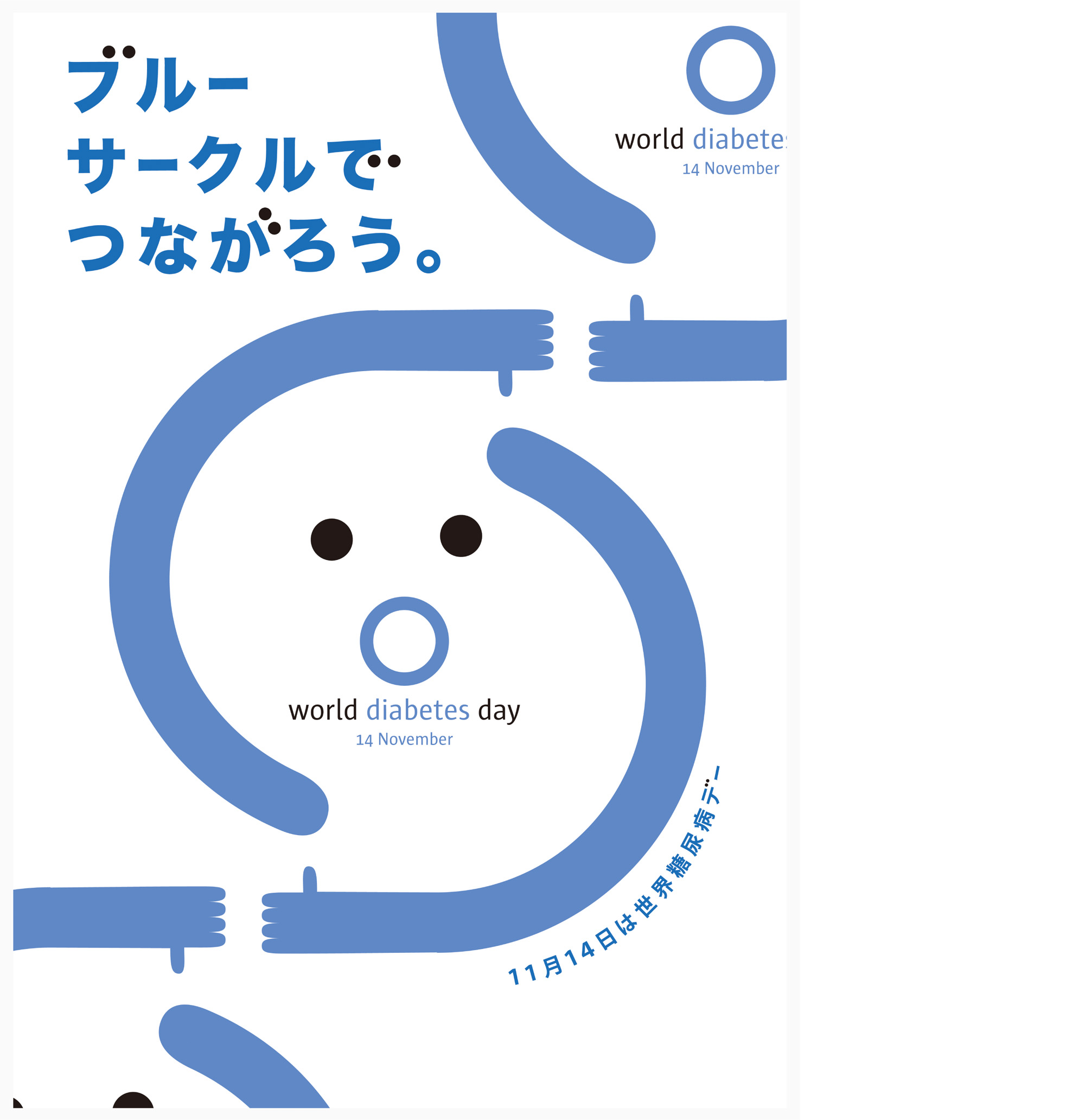
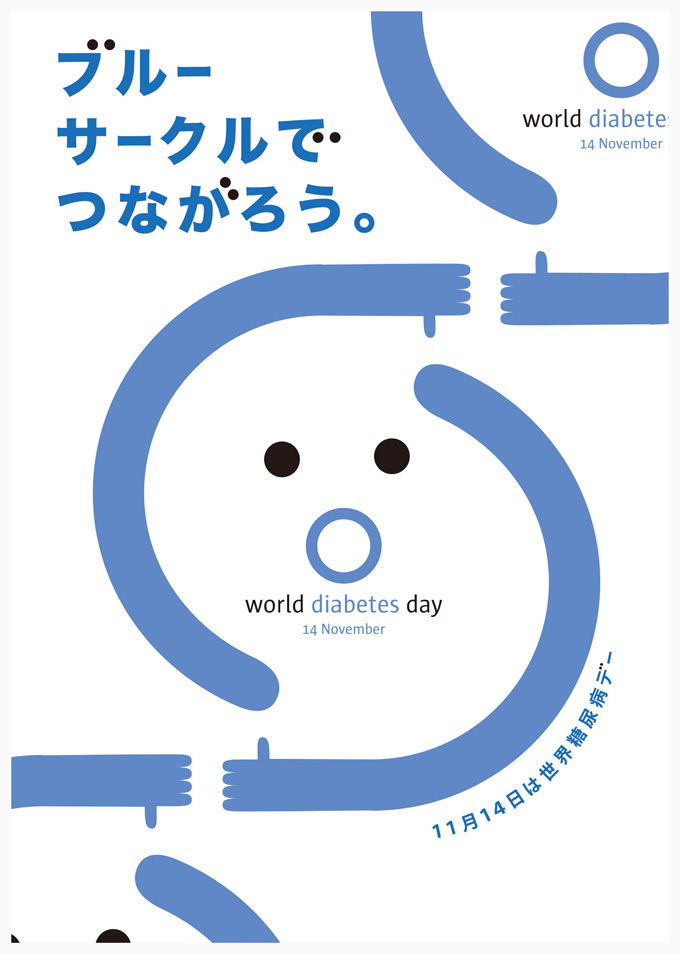
World Diabetes Day Poster contest 2013 - 2014 | World Diabetes Day Committee in Japan
An awareness poster created in Japan for World Diabetes Day, an international observance established by the World Health Organization (WHO). The design incorporates the Blue Circle, the international symbol of diabetes awareness, to encourage greater understanding and awareness of the disease. The concept was “Chain.” The Blue Circle combines blue, symbolizing the United Nations and the sky, with a circle representing unity. By transforming the Blue Circle into a mouth, the design creates a simple and direct visual message about raising awareness of diabetes. The concept of “Chain” represents how individual awareness and understanding can spread from person to person, creating connections and a wider movement. With the number of people affected by diabetes continuing to rise, particularly in developing countries, the design was created to communicate its message visually and intuitively, transcending language barriers.


Branding | The Dog Training HYOKKORI
Title : Bond A branding project for “Dog Training Hyokkori,” a dog training service specializing in training for family dogs. Through a series of interviews, the concept of “Bond” was developed. The training approach focuses on communication between dogs and their owners, with the aim of building a stronger and more positive bond between them. Based on this concept, the identity was developed across the logo, business cards, and leaflets. The visual identity expresses the idea of strengthening the bond between dogs and their owners through meaningful communication.


Roppongi Designer’s Flag Contest 2014 | Roppngi Shopping Street
Title : Roppongi becomes a lens for seeing the future
A visual identity created for the street banners displayed along Roppongi’s shopping district.
With a different theme assigned each year, the theme for 2014 was “Future.” The concept was “Looking into the Future from Roppongi.”
The number “6” in “Roppongi” was reconstructed into the form of a pair of glasses. This simple transformation represents Roppongi’s potential to reflect the future of Japan, the world, and humanity.
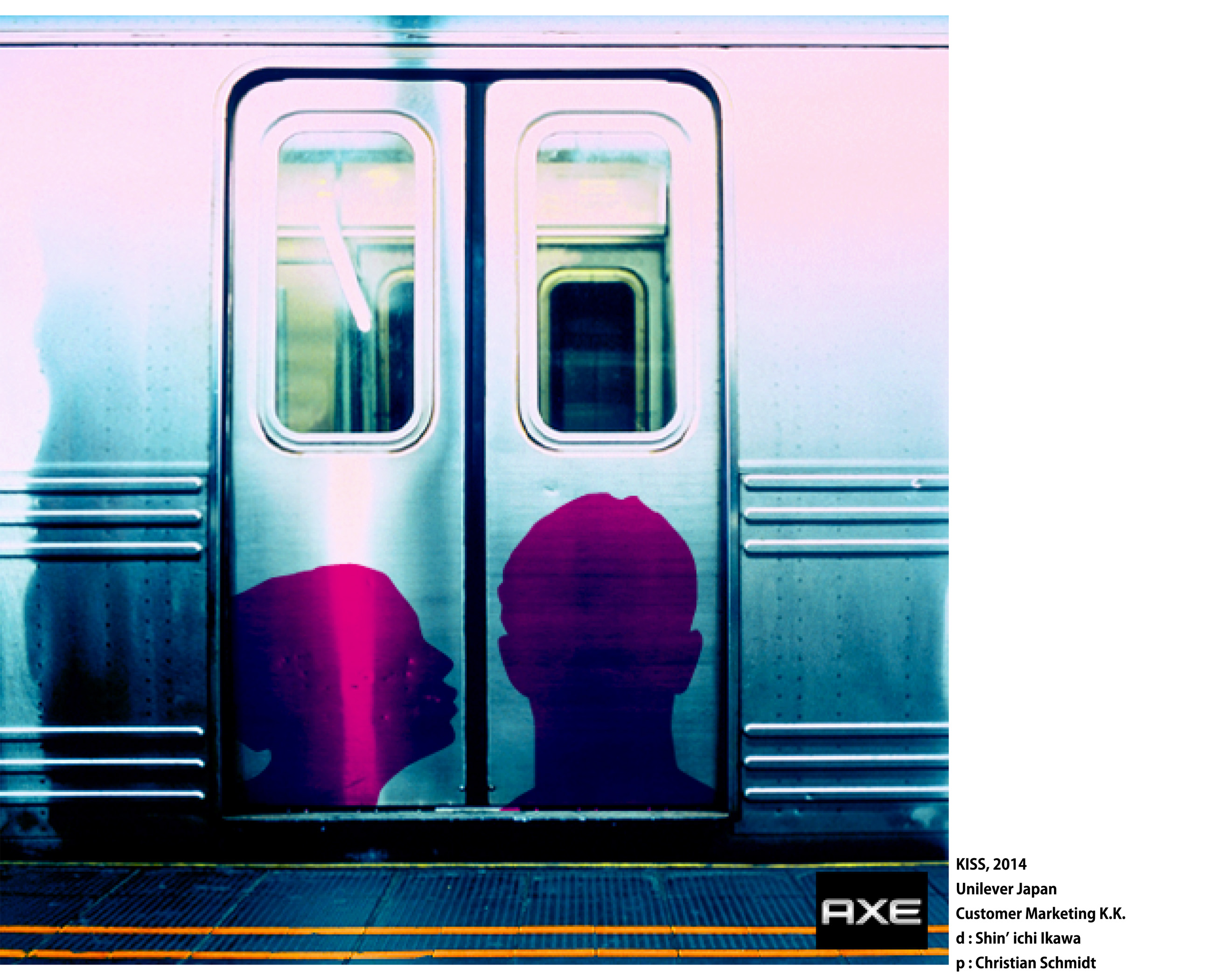
AXE CREATIVE AWARD | Unilever Japan Customer Marketing K.K.
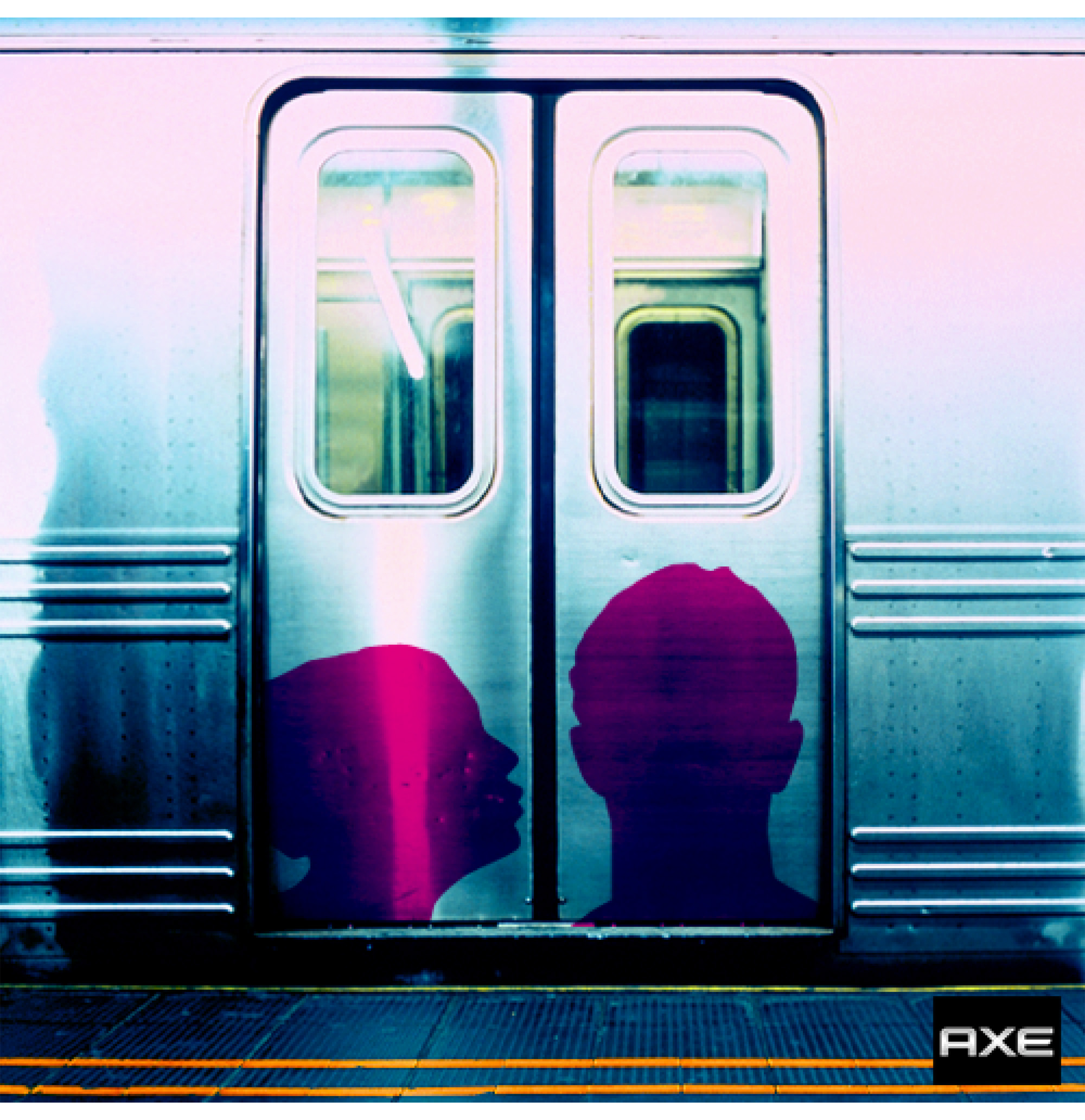
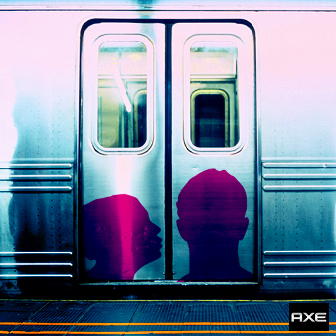
Title : KISS
A visual created to promote AXE’s flagship fragrance body spray across social media and other digital channels.
Silhouettes of a man and a woman were placed on the automatic doors of a train. As the doors open and close, the scene creates the impression of a woman trying to kiss an attractive man, revealing the appeal of AXE through a simple visual interaction.
Targeting young men, the design was developed to communicate the appeal of AXE within just 0.3 seconds.
The visual was featured on AXE’s official Facebook page as part of its product promotion.
Christmas Card 2013 | JDN Inc.
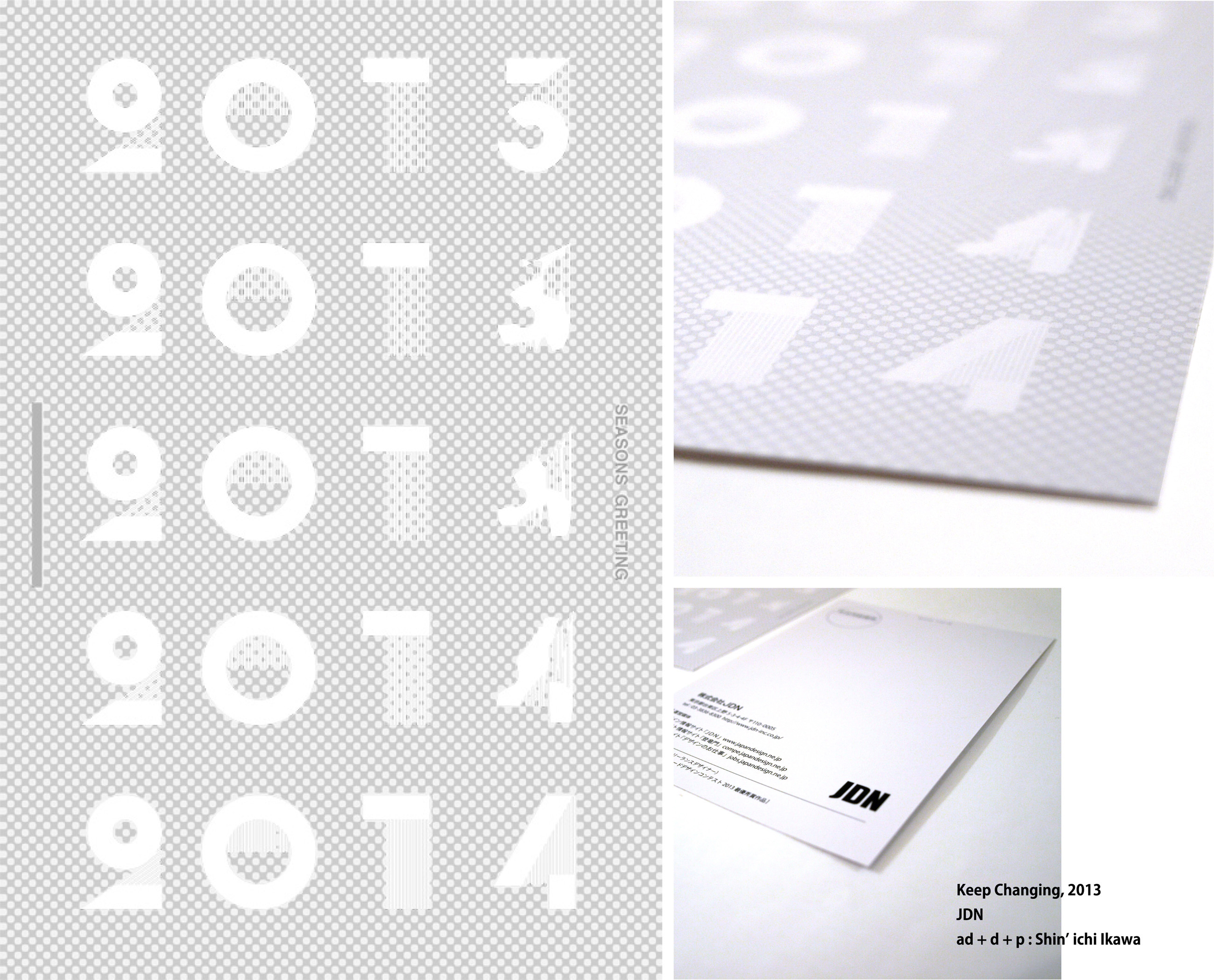
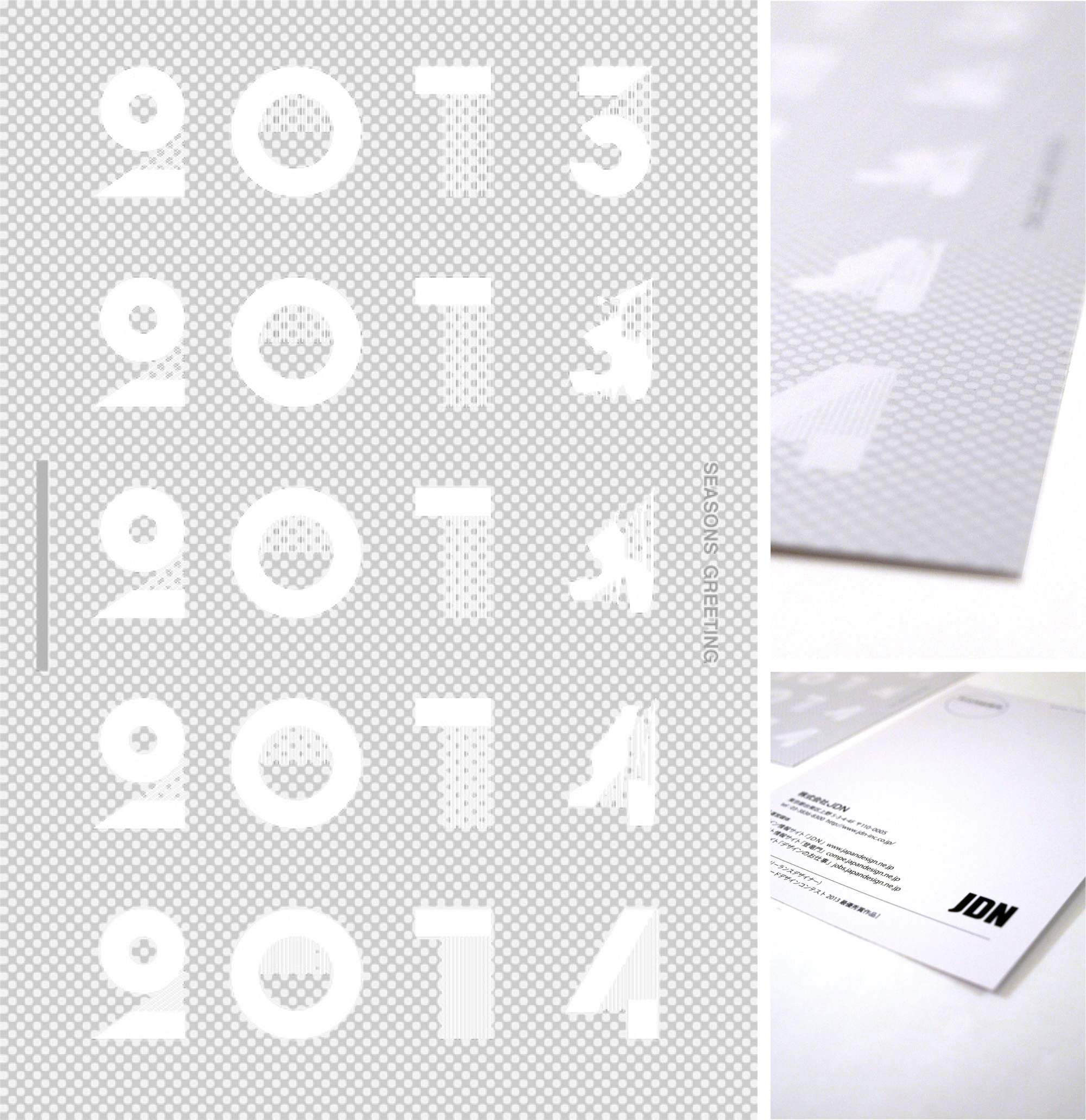
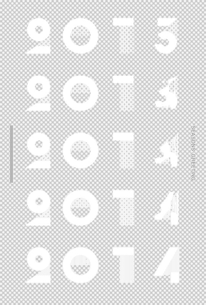
Title : Keep Changing
The design brief was based on the theme “Keep Changing,” with two specific requirements: the theme itself could not be used in the design, and the phrase “SEASONS GREETING” had to be included.
Unlike the usual process of carefully working through numerous ideas, the concept emerged quite naturally. As a Christmas card, snow and numbers were combined as the starting point. The numbers gradually transform, suggesting the transition from one year to the next, while naturally connecting with the company’s underlying theme of continuous change.
Special spot colors were used in the printing to create a sparkling, festive appearance.
A simple idea developed into a visual expression that connects the changing of the year with the spirit of the company.


Mochi pounding shows 2012 | ASA Kokubunji Minamigutci
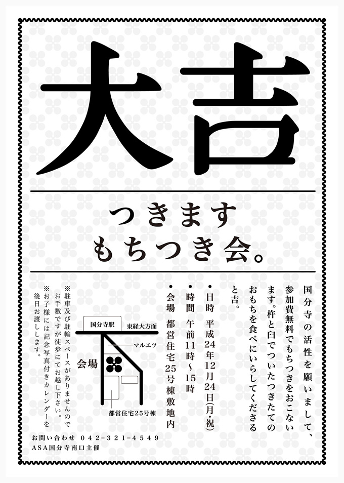
Title : Tsuku
An advertising campaign created for a community mochi-making event held in the neighborhood.
The concept was “Tsuku,” a Japanese word that connects two meanings: making mochi by pounding it, and “tsuku,” meaning to gain good fortune or luck. Mochitsuki was traditionally performed as a prayer for a good harvest, providing the starting point for connecting mochi and good fortune through this wordplay.
The visual identity was inspired by traditional fortune slips, linking the act of making mochi with the idea of bringing good luck. Posters were displayed on community bulletin boards and distributed through local newspaper inserts.
On the day of the event, original fortune slips were made available free of charge to all participants. Based on the “Tsuku” concept, every fortune was set at “Great Luck” or better, ensuring that everyone could take home a positive message.
The annual event attracted approximately two to three times more participants than in previous years. The campaign also succeeded in reaching younger audiences, including students who had not typically participated in the event. The results demonstrated the strength of a consistent concept-driven approach, from the initial idea through to the final communication.